SplitButton
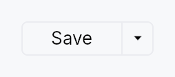
SplitButton — a button split into two regions sharing a single frame.
The left region is the default action: it shows the label of the
currently-selected item and, on click, fires that item's command
(behaving like a regular Button). The right
region is a narrow chevron zone that, on click, opens a
MenuList of related actions. Picking an
action from the dropdown fires it and promotes its index to become the
new default for the session (IntelliJ's "remember last used"
convention).
SplitButton reuses MenuItem verbatim
for the dropdown rows — the caller passes real MenuItem values via
.item(...), so icons, shortcut labels, enabled flags, and separators
all come for free.
#![allow(unused)]
fn main() {
use teksilo_widgets::{SplitButton, MenuItem, ButtonVariant};
use teksilo_i18n::lit;
use teksilo_core::Intent;
let _w = SplitButton::new()
    .item(MenuItem::new(lit!("Run")).on_activate_fn(|ctx| ctx.send_intent(Intent::new("app.run"))))
    .item(MenuItem::new(lit!("Run Tests")).on_activate_fn(|ctx| ctx.send_intent(Intent::new("app.run-tests"))))
    .separator()
    .item(MenuItem::new(lit!("Debug")).on_activate_fn(|ctx| ctx.send_intent(Intent::new("app.debug"))))
    .variant(ButtonVariant::Plain);
}
Builder methods at a glance
new_static, item, separator, variant, icon, style, text_style, text_role, enabled, initial_selected, tooltip, rich_tooltip, rich_tooltip_content, composite_tooltip, chevron_tooltip, chevron_rich_tooltip, chevron_rich_tooltip_content, chevron_composite_tooltip
API reference
📖 Full rustdoc API for this module
pub const SPLIT_BUTTON_HEIGHT
SplitButton design tokens.
#![allow(unused)]
fn main() {
pub const SPLIT_BUTTON_HEIGHT: f32 = 24.0;
}
pub const SPLIT_BUTTON_MIN_WIDTH
#![allow(unused)]
fn main() {
pub const SPLIT_BUTTON_MIN_WIDTH: f32 = 72.0;
}
pub const SPLIT_BUTTON_PADDING_HORIZONTAL
#![allow(unused)]
fn main() {
pub const SPLIT_BUTTON_PADDING_HORIZONTAL: f32 = 14.0;
}
pub const SPLIT_BUTTON_PADDING_VERTICAL
#![allow(unused)]
fn main() {
pub const SPLIT_BUTTON_PADDING_VERTICAL: f32 = 0.0;
}
pub const SPLIT_BUTTON_CORNER_RADIUS
#![allow(unused)]
fn main() {
pub const SPLIT_BUTTON_CORNER_RADIUS: f32 = 4.0;
}
pub const SPLIT_BUTTON_BORDER_WIDTH
#![allow(unused)]
fn main() {
pub const SPLIT_BUTTON_BORDER_WIDTH: f32 = 1.0;
}
pub const SPLIT_BUTTON_CHEVRON_WIDTH
#![allow(unused)]
fn main() {
pub const SPLIT_BUTTON_CHEVRON_WIDTH: f32 = 22.0;
}
pub const SPLIT_BUTTON_DIVIDER_WIDTH
#![allow(unused)]
fn main() {
pub const SPLIT_BUTTON_DIVIDER_WIDTH: f32 = 1.0;
}
pub const SPLIT_BUTTON_CHEVRON_ICON_SIZE
#![allow(unused)]
fn main() {
pub const SPLIT_BUTTON_CHEVRON_ICON_SIZE: f32 = 12.0;
}
pub const SPLIT_BUTTON_ICON_LABEL_GAP
Gap between an optional main-region leading icon and the label.
#![allow(unused)]
fn main() {
pub const SPLIT_BUTTON_ICON_LABEL_GAP: f32 = 6.0;
}
pub struct SplitButton
A button split into a default-action region and a chevron dropdown region.
See the module-level documentation for a usage overview.
#![allow(unused)]
fn main() {
pub struct SplitButton { /* fields */ }
}
Methods
pub fn new() -> Self
Standard SplitButton: picking an item from the dropdown both fires the item's action and promotes it to become the new default for the session. The main region's label and click action update to match the most recently picked item.
pub fn new_static() -> Self
Static-default SplitButton: the main region is pinned to
initial_selected (default 0) and never changes after the
user picks something from the dropdown. Picking an item still
fires that item's action — only the promotion is skipped.
Use this when the main region represents a semantically fixed primary action (e.g. "Commit") and the dropdown offers related variants ("Commit and Push", "Commit and Push to…") that should not displace the primary.
pub fn item(mut self, item: MenuItem) -> Self
Add a menu item. The item is reused verbatim as a row of the dropdown, and its label + action are also used to drive the main region (when its index is the current default).
pub fn separator(mut self) -> Self
Add a separator row in the dropdown. Separators are skipped when
computing item indices for initial_selected.
pub fn variant(mut self, variant: ButtonVariant) -> Self
Set the visual style variant (filled, plain, ghost, …) for the entire
button frame. Mirrors the same variants as
Button::variant.
pub fn icon(mut self, icon: IconWidget) -> Self
Set a leading icon for the main (default-action) region, rendered before
the label (mirrors Button::icon with
IconLocation::Leading). Unlike the per-row MenuItem::icons, this glyph
is fixed regardless of which item is the current default — use it for a
stable action affordance (e.g. a "+" add glyph).
The icon's tint follows the main-region label (the variant/interaction
cascade, or text_role when overridden), so any
colour set on the passed IconWidget is replaced — same contract as
Button. Its size is left alone, so .icon_size(..) on the caller's
widget is honoured.
pub fn style(mut self, style: impl SplitButtonStyle) -> Self
Override the Tier-3 frame chrome for this instance. Takes precedence
over theme.style_slots.split_button and the built-in
RecipeSplitButtonStyle.
pub fn text_style(mut self, style: impl Into<teksilo_core::color_prop::TextStyleProp>) -> Self
Override the main-region label text style (font, size, weight).
Accepts a TextStyleRole, a TextStyle, or a Signal of either.
Default (unset) is the inner TextWidget default — e.g. pass
TextStyleRole::BodyBold for a bold default action.
pub fn text_role(mut self, color: impl Into<teksilo_core::color_prop::ColorProp>) -> Self
Override the control's text colour — the main-region label, its
leading icon, and the chevron, which the
variant/interaction cascade tints together. Accepts Color, a role,
or a Signal of either. Default (unset) is that cascade; setting this
replaces it wholesale (loses hover/disabled tint).
pub fn enabled(mut self, enabled: impl Into<Prop<bool>>) -> Self
Set the enabled state, statically or reactively. Forwarded to the arena at build time.
pub fn initial_selected(mut self, index: usize) -> Self
Which item index (counting only items, not separators) should be the initial default. Defaults to 0.
pub fn tooltip(mut self, text: impl Into<LocalizedString>) -> Self
Attach a tooltip to the main (default-action) region. Same hover
delay as Button::tooltip.
pub fn rich_tooltip(mut self, key: impl Into<String>) -> Self
Attach a rich tooltip to the main region.
pub fn rich_tooltip_content(mut self, content: crate::tooltip::TooltipContent) -> Self
Attach a rich tooltip to the main region driven by inline TooltipContent.
pub fn composite_tooltip( mut self, content: impl teksilo_core::widget::Widget + 'static, ) -> Self
Attach a composite tooltip to the main region.
pub fn chevron_tooltip(mut self, text: impl Into<LocalizedString>) -> Self
Override the tooltip shown on hover over the trailing chevron region. When unset, the chevron gets a default "Show dropdown menu" tooltip so its affordance isn't silent.
pub fn chevron_rich_tooltip(mut self, key: impl Into<String>) -> Self
Attach a rich tooltip to the chevron region.
pub fn chevron_rich_tooltip_content(mut self, content: crate::tooltip::TooltipContent) -> Self
Attach a rich tooltip to the chevron region driven by inline TooltipContent.
pub fn chevron_composite_tooltip( mut self, content: impl teksilo_core::widget::Widget + 'static, ) -> Self
Attach a composite tooltip to the chevron region.