ComboBox
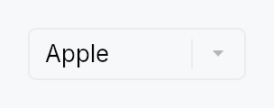
ComboBox — dropdown selection widget.
Generic over the item type T: Clone + PartialEq + 'static. Selection is
value-based: the bound Signal<Option<T>> survives reorder and insertion
of the backing model. Items come from one of four input paths:
ComboBox::new— static list of localizable strings (the 90% case).ComboBox::from_items— static list of typed values.ComboBox::from_model— reactiveListModel<T>.ComboBox::from_source— externalListDataSource<Item = T>.
The dropdown panel is pre-created during build() and kept dormant until
opened via click, Enter, Space, or ArrowDown/ArrowUp.
The widget is split across four internal modules:
stateholds the interaction-state enum, theItemSourceaccessor, and color/index helpers.itemholds the single-rowDropdownItemwidget.panelholds theDropdownPaneloverlay content and theFilteredItemListinner widget.testsholds the headless unit tests.
Builder methods at a glance
from_items, from_model, from_source, item_label, render_item, render_selected, on_select, max_visible_items, type_ahead_timeout, placeholder, label, enabled, variant, style, text_style, text_role, tooltip, rich_tooltip, rich_tooltip_content, composite_tooltip, searchable, search_query, filter
API reference
📖 Full rustdoc API for this module
pub struct ComboBox
A dropdown selection widget.
// Simple: list of strings.
let selected = ctx.signal(None::<String>);
ComboBox::new(["Apple", "Banana", "Cherry"], selected)
    .placeholder(lit!("Select a fruit..."))

// Typed items: any T: Clone + PartialEq, plus a label extractor.
#[derive(Clone, PartialEq)] struct Fruit { name: String, emoji: &'static str }
let selected = ctx.signal(None::<Fruit>);
ComboBox::from_items(fruits, selected)
    .item_label(|f: &Fruit| lit!(format!("{} {}", f.emoji, f.name)))

// Model-backed: reactive.
let model = ListModel::from_vec(fruits);
ComboBox::from_model(model, selected)
    .item_label(|f: &Fruit| lit!(f.name.clone()))
    .max_visible_items(6)
#![allow(unused)]
fn main() {
pub struct ComboBox<T: Clone + PartialEq + 'static> { /* fields */ }
}
Methods
pub fn new( items: impl IntoIterator<Item = impl Into<String>>, selected: Signal<Option<String>>, ) -> Self
Create a ComboBox from a list of strings.
Accepts any impl Into<String> — string literals (&str),
owned Strings, resolved LocalizedStrings, etc. For
translated items, resolve translations before passing in,
e.g. vec![tr!(apple()).resolve_now(), ...].
pub fn from_items<F>( items: impl IntoIterator<Item = T>, selected: Signal<Option<T>>, item_label: F, ) -> Self where F: Fn(&T) -> LocalizedString + 'static,
Static list of typed items. item_label is the display extractor —
it's required at construction so the compiler enforces it rather
than a runtime check. For T = String, use ComboBox::new which
defaults to the identity label.
pub fn from_model<F>(model: ListModel<T>, selected: Signal<Option<T>>, item_label: F) -> Self where F: Fn(&T) -> LocalizedString + 'static,
Backed by a reactive ListModel<T>. Inserts, removes, and reorders
propagate into the dropdown automatically. If the currently-selected
value disappears from the model, selected becomes None.
pub fn from_source<S, F>(source: S, selected: Signal<Option<T>>, item_label: F) -> Self where S: ListDataSource<Item = T> + 'static, F: Fn(&T) -> LocalizedString + 'static,
Backed by a custom ListDataSource — for external or paged data.
pub fn item_label(mut self, f: impl Fn(&T) -> LocalizedString + 'static) -> Self
Override the display-label extractor. Rarely needed — prefer passing
item_label to the constructor. Useful for the ComboBox<String>
path when you want a non-identity projection.
pub fn render_item(mut self, f: impl Fn(&T, bool) -> Box<dyn Widget> + 'static) -> Self
Custom cell rendering. The closure receives the item and a flag indicating whether it is the currently-selected value.
The framework wraps the returned widget with the correct
Role::ListBoxOption accessibility and tap handler, so callers
do not need to manage a11y or selection dispatch themselves.
Reactivity. The bool argument is a snapshot at build time.
If the selection flips after the dropdown is open, the user's
subtree is not automatically re-rendered; the framework-managed
highlight background (behind the custom widget) does update, and
closing and re-opening the dropdown picks up the new state. If
you need a reactive appearance that tracks selection, close over
a Signal<Option<T>> in your closure and compare against the
item value inside a .map() / bind_* on primitives.
Accessibility. The wrapper's set_name(label) (from
item_label) is what screen readers announce. If the returned
widget includes its own text nodes (e.g. a bare TextWidget), the
label may be announced twice — one from the wrapper, one from the
inner text. Wrap primary text nodes in .a11y_hidden() to avoid
duplication, and reserve visible widgets for presentation only.
pub fn render_selected(mut self, f: impl Fn(&T) -> Box<dyn Widget> + 'static) -> Self
Custom renderer for the trigger's selected value — the widget shown
when the combo is closed. The parallel of render_item
for the trigger rather than the dropdown rows.
When set, the closed combo shows f(&value) for the current
selection instead of the plain text label (item_label). The
canonical use is a FontPicker rendering the selected family name in
its own typeface. The subtree is rebuilt whenever the selection
changes and whenever the locale changes (so a None-state
placeholder re-translates), without rebuilding the whole ComboBox.
Accessibility. The rendered subtree is excluded from the
accessibility tree — the ComboBox's own accessibility(builder)
already announces the selected value via set_value, so the custom
visual can never double-announce. When nothing is selected the
trigger shows the placeholder text.
pub fn on_select(mut self, f: impl Fn(&T, &mut EventContext) + 'static) -> Self
Register a callback fired when the user commits a selection — by
tapping a dropdown row or picking one with the keyboard (arrows /
type-ahead / Home / End). The callback receives the chosen value
and a live EventContext, so it can run context-bearing actions
that observing the bound selected signal cannot — e.g.
ctx.set_locale(...), navigation, or opening another overlay.
It fires only on user-driven commits, not on external writes
to the selected signal (those are observed via ctx.effect).
The selected signal is updated before the callback runs.
pub fn max_visible_items(mut self, n: usize) -> Self
Maximum number of items shown before the dropdown becomes scrollable. Defaults to 8. Clamped to at least 1.
pub fn type_ahead_timeout(mut self, d: Duration) -> Self
Reset window for keyboard type-ahead. Keystrokes more than d apart
begin a fresh prefix; within d they extend it. Defaults to 500 ms,
matching MenuList::type_ahead_timeout. Pass Duration::ZERO to
treat each keystroke independently.
pub fn placeholder(mut self, text: impl Into<LocalizedString>) -> Self
Placeholder text shown in the trigger when selected is None.
Accepts a tr!(...) directly (resolved at build); use
placeholder_literal for an
untranslated string.
pub fn label(mut self, label: impl Into<LocalizedString>) -> Self
Accessible label describing what this combo box is for (e.g. "Fruit", "Font family"). Independent of the visible placeholder and of the current selection — screen readers announce this as the name of the control.
pub fn enabled(mut self, enabled: impl Into<Prop<bool>>) -> Self
Set the enabled state, statically or reactively. Forwarded to the arena at build time.
pub fn variant(mut self, variant: ComboBoxVariant) -> Self
Pick a Tier-1 design-language variant
(ComboBoxVariant::Outlined / Filled / Underline / Plain).
The active ComboBoxStyle decides what to do with the hint —
IntUI's default impl honours Outlined (default) and Plain;
a custom impl (Material 3, macOS, etc.) might paint differently.
pub fn style(mut self, style: impl ComboBoxStyle) -> Self
Override the active ComboBoxStyle for this widget instance
only. The default IntUI chrome (crate::styles::RecipeComboBoxStyle)
reads its tokens from theme.components.combo_box; custom impls
can paint anything they want around the selected-label slot.
pub fn text_style(mut self, style: impl Into<teksilo_core::color_prop::TextStyleProp>) -> Self
Override the selected-value text style (font, size, weight).
Accepts a TextStyleRole, a TextStyle, or a Signal of either.
Default (unset) is TextStyleRole::Body.
pub fn text_role(mut self, color: impl Into<teksilo_core::color_prop::ColorProp>) -> Self
Override the selected-value text color. Accepts Color, a role, or
a Signal of either. Default (unset) is enabled-derived
(Primary / Disabled); setting this replaces that cascade.
pub fn tooltip(mut self, text: impl Into<LocalizedString>) -> Self
Attach a plain tooltip that appears after a hover delay. The tooltip is anchored to the trigger only — with the framework's overlay-boundary gate it does not re-trigger while the pointer is over the open dropdown's option rows.
Mutually exclusive with rich_tooltip /
rich_tooltip_content /
composite_tooltip — last call wins.
pub fn rich_tooltip(mut self, key: impl Into<String>) -> Self
Attach a rich tooltip resolved from the app-wide tooltip registry.
The key is looked up via
TooltipRegistry at build
time; the resolved body supports inline markup, a shortcut chip,
and a "more" disclosure. Overrides any previously set tooltip.
pub fn rich_tooltip_content(mut self, content: crate::tooltip::TooltipContent) -> Self
Attach a rich tooltip driven by inline
TooltipContent — for one-off
tooltips that aren't worth registering centrally. Overrides any
previously set tooltip.
pub fn composite_tooltip(mut self, content: impl Widget + 'static) -> Self
Attach a composite tooltip — third tier, hosting an arbitrary
widget tree (tabbed sections, charts, conditional rows). Promotes
to a focusable Role::Dialog after the standard dwell. Overrides
any plain or rich tooltip previously set.
pub fn searchable(mut self, enabled: bool) -> Self
Show a search field at the top of the dropdown panel and filter
the list live against the user's query. When true, items are
matched by the closure passed to filter, or —
if no filter is set — by a case-insensitive substring match on
the item_label.
The search input becomes a child of the dropdown panel only, not of the trigger: the closed combo box looks identical whether searchable or not.
The query signal is created internally. Use
search_query to supply your own if you
want to observe or drive the query externally.
pub fn search_query(mut self, query: Signal<String>) -> Self
Bind the search field to an external Signal<String>. Implies
searchable(true). Useful for observing or
programmatically setting the query from outside the widget
(e.g. a "Clear" button, persistence across sessions).
pub fn filter(mut self, f: impl Fn(&str, &T) -> bool + 'static) -> Self
Custom match predicate for searchable mode. Called on every
visible-item pass with the current query string (as typed, not
normalized) and a reference to the item; return true to keep
the item in the filtered list. Only consulted when
searchable is true. Ignored otherwise.