ColumnFlow
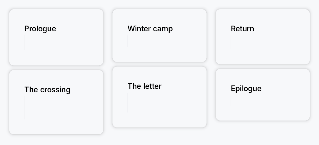
ColumnFlow — flows children into as many columns as the width affords,
re-partitioning every child when a column is gained or lost.
The newspaper / CSS multi-column model: content runs down column 0, then
down column 1, and so on. The column count is derived from the available
width and min_column_width — when the
width no longer affords N columns the layout drops to N−1 and all
children are re-partitioned across the survivors. Children are atomic: one
child never straddles a column boundary.
Pair it with a ScrollArea for vertical
overflow — ColumnFlow reports its true content height (the tallest
column), so the scroll extent is correct.
#![allow(unused)]
fn main() {
use teksilo_widgets::primitives::column_flow::ColumnFlow;
use teksilo_widgets::primitives::TextWidget;
use teksilo_widgets::scroll_area::ScrollArea;
use teksilo_i18n::lit;
let _view = ScrollArea::new().child(
    ColumnFlow::new()
        .min_column_width(240.0)
        .max_columns(4)
        .column_spacing(16.0)
        .item_spacing(12.0)
        .child(TextWidget::new(lit!("First")))
        .child(TextWidget::new(lit!("Second")))
        .child(TextWidget::new(lit!("Third"))),
);
}
Reading order
Children are distributed as contiguous runs in source order — column 0
takes children 0..i, column 1 takes i..j. So source order, visual
reading order, and focus order are the same thing, at every column count.
This is why ColumnFlow does not reuse
MasonryLayout's shortest-column
packing, which interleaves children and would divorce the visual order from
the source order.
Accessibility
By default ColumnFlow emits a bare Role::GenericContainer carrying no
properties, which the accessibility walker prunes, promoting the children
to its parent in source order. That is the correct outcome for a layout
primitive: it contributes geometry, not semantics, and the reading order is
already right. Add semantics from the outside with .access_role(..) /
.access_label(..), or opt into list semantics with
semantic_list.
Relationship to CSS multi-column
Close, but not identical. CSS column-fill: balance balances content within
a column height it computes from a bounded block size; ColumnFlow derives
the column count from the width and lets the height run free (a
ScrollArea absorbs it). No CSS column-fill mode does that, so don't read
this as a CSS multicol port.
Builder methods at a glance
min_column_width, max_column_width, max_columns, column_spacing, item_spacing, alignment, column_rule, semantic_list, add_child, child, children, child_opt, column_count_signal
API reference
📖 Full rustdoc API for this module
pub struct ColumnFlow
A layout that flows its children into as many columns as the available width affords, re-partitioning every child when a column is gained or lost.
 wide                            narrower
┌────┐ ┌────┐ ┌────┐            ┌────┐ ┌────┐
│ 1  │ │ 3  │ │ 5  │            │ 1  │ │ 4  │
├────┤ ├────┤ ├────┤            ├────┤ ├────┤
│ 2  │ │ 4  │ │ 6  │    ───►    │ 2  │ │ 5  │
└────┘ └────┘ └────┘            ├────┤ ├────┤
                                │ 3  │ │ 6  │
                                └────┘ └────┘
Reading order is 1..6 at both widths. See the module docs.
#![allow(unused)]
fn main() {
pub struct ColumnFlow { /* fields */ }
}
Methods
pub fn new() -> Self
Create a ColumnFlow with a 240 dp minimum column width, no maximum
column width, and no column-count cap.
pub fn min_column_width(mut self, width: f32) -> Self
The narrowest a column may be. The column count is the largest N whose
columns are all at least this wide — CSS column-width / SwiftUI
GridItem(.adaptive(minimum:)) / Compose GridCells.Adaptive(minSize).
A value of zero or less pins the layout to a single column.
pub fn max_column_width(mut self, width: f32) -> Self
The widest a column may be. Unset by default, so columns stretch to share the full width evenly.
Set it to stop columns becoming unreadably wide when few of them fit a
large display — the reason KDE's Kirigami.CardsLayout pairs
minimumColumnWidth with maximumColumnWidth. When it bites, the
columns no longer fill the width and
alignment decides where the block sits.
pub fn max_columns(mut self, max: usize) -> Self
Never use more than max columns however wide the layout gets.
Also decides the count when the width is unconstrained (inside a
size-to-content parent such as a popover): unset, that case reports one
column, matching CSS column-count: auto in a shrink-to-fit context.
Clamped to at least 1.
pub fn column_spacing(mut self, spacing: impl Into<Prop<f32>>) -> Self
Horizontal gap between columns. Accepts an f32 or a Signal<f32>.
pub fn item_spacing(mut self, spacing: impl Into<Prop<f32>>) -> Self
Vertical gap between items within a column. Accepts an f32 or a
Signal<f32>.
Named for items rather than rows because there are no rows here: a column's items are independent of its neighbours'.
pub fn alignment(mut self, alignment: HAlignment) -> Self
Where the column block sits when it does not fill the available width.
Only observable once max_column_width clamps
the columns narrower than their even share — otherwise the columns
consume the whole width and there is nothing to align. Defaults to
HAlignment::Leading; RTL-aware.
pub fn column_rule(mut self, width: f32, color: impl Into<ColorProp>) -> Self
Draw a rule of width dp, centred in every inter-column gap — CSS
column-rule.
Purely decorative: it emits no accessibility node. Accepts a Color, a
theme role, or a Signal. Pass BorderRole::Divider to track the
theme's divider colour.
pub fn semantic_list(mut self, enabled: bool) -> Self
Expose the children to assistive technology as a list.
The container becomes Role::List and every child is wrapped in a
layout-transparent node reporting Role::ListItem with its position and
the set size, so a screen reader announces "list, 30 items" and
"item 5 of 30" rather than reading 30 unrelated widgets.
Off by default: a layout primitive should not invent semantics its content may not have. Turn it on when the children genuinely are a list of peers. Costs one extra node per child.
pub fn add_child(mut self, id: WidgetId) -> Self
Add a pre-registered child by ID.
pub fn child(mut self, widget: impl Widget + 'static) -> Self
Add an inline child widget (deferred insertion).
pub fn children(mut self, iter: impl IntoIterator<Item = impl Widget + 'static>) -> Self
Add multiple inline children from an iterator.
pub fn child_opt(mut self, widget: Option<impl Widget + 'static>) -> Self
Conditionally add a child. No-op if None.
pub fn column_count_signal(&self) -> Signal<usize>
The live column count, as a reactive signal.
Lets an app follow the reflow — swapping to a compact header at one column, say. Written from the layout pass behind an equality guard, so it only fires when the count actually changes.
Binding contract. Safe for RepaintOnly / AccessibilityOnly
consumers, and for Relayout consumers that do not feed back into this
widget's own width. The count is a pure function of the width
ColumnFlow is given — it never changes its own width, so it cannot
oscillate on its own. But a Relayout consumer that resizes something
which in turn resizes this ColumnFlow closes a feedback loop through
the layout pass, which is exactly what
Widget::place_children's own documentation warns against.