TooltipWidget
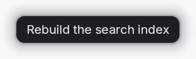
Tooltip system — hover-triggered overlays with configurable delay.
Three tiers, increasing in expressive power:
TooltipWidget— single line of localized text in a themed rounded rect. Attached via the per-widget.tooltip(...)setter.RichTooltipWidget—TooltipContent-driven (body + optional long-form "more" disclosure + shortcut chip), inline-markup body solabelcascade links resolve againstTooltipRegistry. Attached via.rich_tooltip(key)/.rich_tooltip_content(content). On dwell it flips its AT role toRole::Dialogand advertises aFocusaction — keyboard focus is not auto-transferred; the user Tabs in (the correct non-modal-panel a11y pattern).composite::CompositeTooltipWidget— hosts an arbitraryimpl Widget + 'staticbody inside the same chrome with a larger surface budget. Crusader Kings 3-style: tabbed sections, charts, progress bars, conditional rows. Attached via.composite_tooltip(content). "Primary-only" by construction — has no inline-markup body and no registry key, so it cannot be the target of alabelcascade. Child widgets inside the body keep their own tooltip setters and cascade normally.
All three tiers share the same overlay machinery, hover/focus
tracking, and dwell-promotion timer in teksilo-core. The per-widget
setters (.tooltip / .rich_tooltip / .composite_tooltip) are
mutually exclusive (last-one-wins): each setter clears the others.
Example — plain tooltip
#![allow(unused)]
fn main() {
use teksilo_widgets::tooltip::TooltipWidget;
use teksilo_i18n::lit;
let _tip = TooltipWidget::new(lit!("Save the current file"));
}
Builder methods at a glance
bound, style
API reference
📖 Full rustdoc API for this module
pub struct TooltipWidget
A tooltip content widget — a themed rounded rect with text.
Composes a TextWidget with Small typography in tooltip_text color,
then delegates the chrome (shadow, dark background, corner radius,
padding) to the active TooltipStyle (default
crate::styles::RecipeTooltipStyle). Apps install per-call
(TooltipWidget::new(...).style(impl TooltipStyle)) or theme-wide
via theme.style_slots.tooltip = Some(Rc::new(MyTooltip)).
#![allow(unused)]
fn main() {
pub struct TooltipWidget { /* fields */ }
}
Methods
pub fn new(text: impl Into<LocalizedString>) -> Self
Construct a tooltip from a localized string. With an I18nManager
installed the body stays locale-reactive (re-resolves on locale
change); otherwise it's a static snapshot.
pub fn bound(text: impl Into<Prop<String>>) -> Self
Construct a tooltip whose body is driven by a Signal<String>
(or any Prop<String>). Mutating the signal re-renders the
tooltip in place — used when a single dormant tooltip surface is
reused across many anchors and its text is set just before each
show. Callers wanting locale reactivity should resolve their
LocalizedString against the active locale when setting the
signal.
pub fn style(mut self, style: impl teksilo_core::styles::TooltipStyle) -> Self
Per-call style override. Replaces the theme-wide default
TooltipStyle for just this TooltipWidget instance.