Toggle
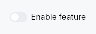
Toggle — an animated on/off switch bound to a Signal<bool>.
Renders as a sliding-knob switch (IntUI default) or one of the alternate
ToggleVariant shapes. All visual chrome is delegated to a ToggleStyle
impl; the widget itself owns only event handling (tap, Space, AccessKit
Click). The IntUI recipe
(crate::styles::RecipeToggleStyle) ships out of the box; apps install a
custom look per-call with .style(impl ToggleStyle) or theme-wide via
theme.style_slots.toggle = Some(Rc::new(…)).
Accessibility
Emits Role::Switch with toggled reflecting the signal value. Always pair
with .label(…) — the debug build asserts that a label is present, and
screen readers will announce "switch" with no context if it is absent.
Example
#![allow(unused)]
fn main() {
use teksilo_widgets::Toggle;
use teksilo_core::signal::Signal;
use teksilo_i18n::lit;
let dark_mode = Signal::new(false);
let _w = Toggle::new(dark_mode)
    .label(lit!("Dark mode"));
}
Builder methods at a glance
label, labelled_externally, enabled, variant, style, tooltip, rich_tooltip, rich_tooltip_content, composite_tooltip
API reference
📖 Full rustdoc API for this module
pub struct Toggle
An animated toggle switch bound to a Signal<bool>.
#![allow(unused)]
fn main() {
pub struct Toggle { /* fields */ }
}
Methods
pub fn new(on: Signal<bool>) -> Self
Create a toggle bound to on. The signal is both read (to paint the
current state) and written (flipped on each activation).
pub fn label(mut self, label: impl Into<LocalizedString>) -> Self
Accessible label announced by AT and optionally displayed beside the switch.
pub fn labelled_externally(mut self) -> Self
Declare that this toggle's accessible name comes from a sibling label
widget, wired by a container after mount (FormLayout::line does this
via access_labelled_by).
Without it the debug assertion below fires even though the toggle is
properly labelled: the labelled_by relation is pushed post-mount, so
accessibility() cannot see it and every form-hosted toggle looks
nameless. Setting .label(..) instead would satisfy the assert but
render the text a second time, beside a label column that already has it.
pub fn enabled(mut self, enabled: impl Into<Prop<bool>>) -> Self
Set the enabled state, statically or reactively. Forwarded to the
arena via ctx.enabled_when(self_id, self.enabled.clone()) at
build time.
pub fn variant(mut self, variant: ToggleVariant) -> Self
Pick a Tier-1 design-language variant
(ToggleVariant::Switch / Pill / Square / Inset). The
active ToggleStyle decides what to do with the hint —
IntUI's default impl honours all four; a custom impl might
ignore the variant entirely.
pub fn style(mut self, style: impl ToggleStyle) -> Self
Override the active ToggleStyle for this widget instance
only. Useful for one-off custom-painted toggles in a single
view.
pub fn tooltip(mut self, text: impl Into<LocalizedString>) -> Self
Attach a plain single-line tooltip shown after a hover delay.
Mutually exclusive with rich_tooltip,
rich_tooltip_content, and
composite_tooltip — the last setter
called wins and clears the others.
pub fn rich_tooltip(mut self, key: impl Into<String>) -> Self
Attach a rich tooltip looked up by registry key.
Mutually exclusive with the other tooltip setters — the last setter called wins and clears the others.
pub fn rich_tooltip_content(mut self, content: crate::tooltip::TooltipContent) -> Self
Attach a rich tooltip from an inline crate::tooltip::TooltipContent
value rather than a registry key.
Mutually exclusive with the other tooltip setters — the last setter called wins and clears the others.
pub fn composite_tooltip(mut self, content: impl Widget + 'static) -> Self
Attach a composite tooltip whose body is an arbitrary widget tree.
Mutually exclusive with the other tooltip setters — the last setter called wins and clears the others.