ThemeSwitcher
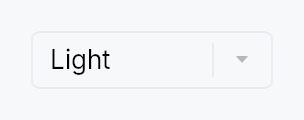
ThemeSwitcher — a drop-in app-theme picker for settings screens & toolbars.
A thin ComboBox preset that switches the application theme. By default
it offers three entries — Light, Dark, and System — where
System follows the native OS theme live: it adopts the OS's actual colours
(GNOME / KDE / Cinnamon on Linux) and tracks OS light/dark changes at
runtime, falling back to the built-in light/dark presets on platforms
without OS-colour support.
Zero-config: drop ThemeSwitcher::new() into a settings panel or toolbar and
it
- shows the active theme as the current selection (matched by the theme's
stable
ThemeId), - switches the app theme on selection via
EventContext::set_theme(fixed themes) orEventContext::follow_system_theme(System), - and stays in sync if the theme changes elsewhere (a menu, the inspector, or an OS light/dark toggle).
// In a settings panel or toolbar:
Toolbar::new().child(HStack::new().child(Spacer::new()).child(ThemeSwitcher::new()))
Labels are translated via the framework Fluent bundle (tr_widget!),
with an English literal fallback so a host app that hasn't installed an
I18nManager still reads "Light / Dark / System" rather than raw keys.
Custom themes: .themes([(label, theme), …]) replaces Light/Dark with an
app-supplied set (e.g. the teksilo-theme-{fluent,macos,material3} presets);
.system(false) drops the System entry.
Builder methods at a glance
variant, label, themes, system, tooltip, rich_tooltip, rich_tooltip_content, composite_tooltip
API reference
📖 Full rustdoc API for this module
pub struct ThemeSwitcher
A drop-in app-theme picker built on ComboBox. See the module docs.
#![allow(unused)]
fn main() {
pub struct ThemeSwitcher { /* fields */ }
}
Methods
pub fn new() -> Self
Create a switcher offering Light / Dark / System (the System entry follows the OS theme live).
pub fn variant(mut self, variant: ComboBoxVariant) -> Self
Pick the inner ComboBox's design-language variant.
pub fn label(mut self, label: impl Into<LocalizedString>) -> Self
Set the accessible / control label (defaults to the translated "Theme").
pub fn themes( mut self, themes: impl IntoIterator<Item = (impl Into<LocalizedString>, Theme)>, ) -> Self
Replace the default Light/Dark fixed-theme list with an app-supplied set
of (label, theme) pairs — e.g. the teksilo-theme-* presets. The
System (follow-OS) entry is still appended unless system
is false.
pub fn system(mut self, include: bool) -> Self
Whether to offer the "System" (follow-OS) entry. Default true.
pub fn tooltip(mut self, text: impl Into<LocalizedString>) -> Self
Attach a plain tooltip, forwarded to the inner ComboBox.
Mutually exclusive with the rich / composite variants — last
call wins.
pub fn rich_tooltip(mut self, key: impl Into<String>) -> Self
Attach a rich tooltip resolved from the app-wide registry,
forwarded to the inner ComboBox. Overrides any previously
set tooltip.
pub fn rich_tooltip_content(mut self, content: crate::tooltip::TooltipContent) -> Self
Attach a rich tooltip driven by inline
TooltipContent, forwarded to
the inner ComboBox. Overrides any previously set tooltip.
pub fn composite_tooltip(mut self, content: impl Widget + 'static) -> Self
Attach a composite tooltip hosting an arbitrary widget tree,
forwarded to the inner ComboBox. Overrides any previously
set tooltip.