TextInput
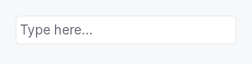
TextInput — styled single-line text field composite.
Wraps the TextInputField
editing primitive in a bordered, padded frame with placeholder
overlay, validation, optional clear button, and leading/trailing
slots. All actual text editing is delegated to the field: every
configuration method here has a direct counterpart on the
primitive.
Most applications want TextInput. Choose
TextInputField directly
when you're building a composite of your own that already
supplies its frame — SpinBox is the canonical in-tree example.
Example
let search = ctx.signal(String::new());
TextInput::new(search.clone())
    .placeholder("Search...")
    .show_clear_button(true)
    .leading_slot(IconWidget::from_svg(SEARCH_ICON))
    .on_submit_fn(|ctx| ctx.send_intent(AppIntent::Search))
Builder methods at a glance
variant, style, placeholder, label, enabled, read_only, max_length, show_clear_button, min_width, leading_slot, trailing_slot, on_submit_fn, on_blur_fn, char_filter, suffix, input_mask, input_purpose, active_descendant, controls, validator, caret_position, handle, caret_setter, validation_feedback_signal, validation, validation_feedback, tooltip, rich_tooltip_key, rich_tooltip, rich_tooltip_content, composite_tooltip, text
API reference
📖 Full rustdoc API for this module
pub enum ValidationState
Validation state for the text input field.
Drives the inline feedback strip and border tint of TextInput.
#![allow(unused)]
fn main() {
pub enum ValidationState { /* variants */ }
}
Variants
None— No validation message — the field is pristine or valid.Error— The committed value is invalid;LocalizedStringis shown in red below the field.Warning— The committed value is suspicious but accepted;LocalizedStringis shown as a warning.Corrected— Last commit was auto-corrected; the field's value has already been replaced with the normalized form. The composite renders the message in secondary text and tints the border accent briefly (decay-managed by the framework's frame loop, not a concern of this enum).
pub struct TextInput
Styled single-line text input composite.
See the module-level documentation for usage examples.
#![allow(unused)]
fn main() {
pub struct TextInput { /* fields */ }
}
Methods
pub fn new(text: Signal<String>) -> Self
Construct a new text input bound to text.
pub fn variant(mut self, variant: TextInputVariant) -> Self
Pick a Tier-1 design-language variant
(TextInputVariant::Outlined / Filled / Underline / Bare).
The IntUI default (crate::styles::RecipeTextInputStyle) honours
Outlined, Filled, and Bare; Underline falls back to
Outlined until per-side stroke recipes land.
pub fn style(mut self, style: impl TextInputStyle) -> Self
Override the active TextInputStyle for this widget instance
only. The widget keeps responsibility for caret blinking, IME
composition, the placeholder layering, the leading / trailing
slots and the validation strip — the style only paints the
frame (border / fill / corner radius).
pub fn placeholder(mut self, text: impl Into<LocalizedString>) -> Self
Set the placeholder text shown when the field is empty.
pub fn label(mut self, label: impl Into<LocalizedString>) -> Self
Accessible name for the composite. Propagated to the outer
container's a11y node; the inner TextInputField still
carries Role::TextInput with the document's value.
pub fn enabled(mut self, enabled: impl Into<Prop<bool>>) -> Self
Set the enabled state, statically or reactively. Forwarded to the
arena and the inner TextInputField at build time.
pub fn read_only(mut self, read_only: bool) -> Self
Set the field read-only: text is selectable and copyable but not editable.
pub fn max_length(mut self, max_length: usize) -> Self
Limit the number of Unicode scalar values the field will accept.
pub fn show_clear_button(mut self, show: bool) -> Self
Show or hide the trailing ✕ button that clears the field text. Default: hidden.
pub fn min_width(mut self, w: f32) -> Self
Override the frame's intrinsic minimum width (default 65 dp). Use to express a design width for date / time / phone-number fields whose content is well-known and whose collapse to the generic 65 dp floor would look out of place.
pub fn leading_slot(mut self, widget: impl Widget + 'static) -> Self
Set an arbitrary widget in the leading slot (before the text area).
Typically an IconButton or IconWidget.
pub fn trailing_slot(mut self, widget: impl Widget + 'static) -> Self
Set an arbitrary widget in the trailing slot (after the text area).
Typically an IconButton or IconWidget.
pub fn on_submit_fn(mut self, f: impl Fn(&mut EventContext) + 'static) -> Self
Closure invoked on Enter. Forwarded to TextInputField.
pub fn on_blur_fn(mut self, f: impl Fn(&mut EventContext) + 'static) -> Self
Closure invoked on focus loss. Forwarded to TextInputField.
pub fn char_filter(mut self, f: impl Fn(char) -> bool + 'static) -> Self
Per-character input-filter predicate. Forwarded to
TextInputField.
pub fn suffix(mut self, text: impl Into<String>) -> Self
Non-editable trailing string (Qt's QSpinBox::suffix).
Forwarded to TextInputField.
pub fn input_mask(mut self, mask: impl Into<String>) -> Self
Install an input mask (Qt grammar). Forwarded 1:1 to
TextInputField::input_mask. Composing widgets like
DateEdit use this to project the date format pattern
onto the editing surface.
pub fn input_purpose( mut self, purpose: crate::primitives::text_input_field::InputPurpose, ) -> Self
Declare the field's semantic InputPurpose
(WCAG 1.3.5), forwarded to the inner TextInputField to select a
specialised AT role (e.g. Role::EmailInput).
pub fn active_descendant(mut self, active: Signal<Option<WidgetId>>) -> Self
Publish active_descendant on the inner field, pointing at the row a
separate listbox is currently highlighting (the ARIA combobox pattern).
Forwarded 1:1 to TextInputField::active_descendant, which is where
it has to land: AT follows the focused node's active descendant, and
the inner field is the focusable one.
pub fn controls(mut self, listbox: Signal<Option<WidgetId>>) -> Self
Publish a controls relation to the listbox this input drives.
Forwarded 1:1 to TextInputField::controls.
pub fn validator( mut self, f: impl Fn(&str) -> crate::primitives::text_input_field::ValidationOutcome + 'static, ) -> Self
Install a commit-time validator. Forwarded 1:1 to
TextInputField::validator. Pair with
Self::validation_feedback_signal (or
Self::validation_feedback) to surface the outcome
in the inline strip.
pub fn caret_position(&self) -> Signal<usize>
Reactive caret position. Mirrors the inner field's
TextInputField::caret_position after build. Capture
before ctx.add(text_input) — used by composing widgets
(DateEdit segment-stepping) that need to know which
segment Up/Down should step.
pub fn handle(&self) -> crate::primitives::TextFieldHandle
A live handle on the inner field — its text-editing commands, for a host outside the widget.
Mirrors TextInputField::handle, and exists for the same reason: an
application that routes Undo, Cut, Copy, Paste and Select All to
"whichever text surface holds the caret" must be able to reach every
such surface. A TextInput that could not be reached would silently
lose its own Ctrl+Z to whatever the host routed the chord at instead.
Like caret_setter, safe to take before build:
the handle reaches the field through a slot the widget fills in.
pub fn caret_setter(&self) -> std::rc::Rc<dyn Fn(usize)>
Programmatic caret setter. Mirrors the inner field's
TextInputField::caret_setter. Returns a closure that
is a no-op until build runs; afterwards it walks the
inner field's state and moves the document cursor. Capture
before ctx.add(text_input).
pub fn validation_feedback_signal(&self) -> Signal<ValidationFeedback>
Reactive published validation feedback. Mirrors the inner
field's TextInputField::validation_feedback_signal
after build. Composing widgets observe this to compose
feedback across multiple fields (range editor's
worse-of-two ladder, etc.).
pub fn validation(mut self, validation: impl Into<Prop<ValidationState>>) -> Self
Bind an external ValidationState signal directly (e.g. when
validation runs server-side), or set a fixed initial value. Use
validation_feedback
when wiring a local validator's output.
A bound Signal becomes the shared write target used internally
(by the validator-feedback bridge) and externally by the caller —
preserving the two-way channel this method has always offered. A
static value seeds a fresh, unshared signal.
pub fn validation_feedback(mut self, feedback: Signal<ValidationFeedback>) -> Self
Bridge a Signal<ValidationFeedback> (typically from a
validator-equipped widget like DateEdit::validation_feedback_signal
or a custom TextInputField) into this composite's
ValidationState. The feedback is mirrored on every change,
translating outcomes into the composite's display vocabulary:
Pristine/Valid→ValidationState::NoneCorrected { message, .. }→ValidationState::Corrected(message)Invalid { message }→ValidationState::Error(message)
pub fn tooltip(mut self, text: impl Into<LocalizedString>) -> Self
Attach a plain tooltip. Accepts tr!(...) or lit!(...).
pub fn rich_tooltip_key(mut self, key: impl Into<String>) -> Self
Attach a registry-driven rich tooltip by key. Mutually exclusive with
tooltip and composite_tooltip (last call wins).
pub fn rich_tooltip(mut self, content: tooltip::TooltipContent) -> Self
Attach an inline rich tooltip from a pre-built tooltip::TooltipContent.
Mutually exclusive with tooltip and composite_tooltip (last call wins).
pub fn rich_tooltip_content(mut self, content: crate::tooltip::TooltipContent) -> Self
Attach an inline rich tooltip from a pre-built tooltip::TooltipContent.
Canonical alias for Self::rich_tooltip — matches the name used by
Button, ComboBox, and other widgets. Mutually exclusive with
tooltip and composite_tooltip (last call wins).
pub fn composite_tooltip( mut self, content: impl teksilo_core::widget::Widget + 'static, ) -> Self
Attach a composite tooltip — third tier, hosting an arbitrary
widget tree. See Button::composite_tooltip.
pub fn text(&self) -> Signal<String>
The reactive text content signal.