Stepper
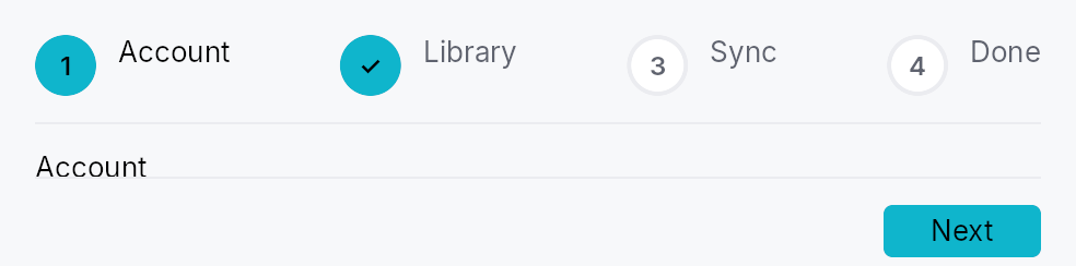
Stepper — a modern, embeddable step-flow widget (Material/Ant/Flutter
"stepper"), and Wizard, a thin modal launcher built on it.
A stepper shows a visible step-indicator strip above (or beside) a
content area driven by a Switcher, with a
footer of Back / Skip / Help / Next / Finish controls. It supports linear
and non-linear (clickable) navigation, optional + skippable steps, per
step validation gating, a generic chrome slot, and a
StepperController handle for programmatic reset / jump / introspection.
Data flow
The application owns its form state as Signals. A step's content factory
captures clones of those signals (write side); Step::complete_when
derives the Next gate from the same signals; and
Stepper::on_finish reads them back — plus the StepperController for
per-step introspection (visited / skipped) — to branch on the choices
made. There is no QVariant field registry: plain shared signals are the
cross-step channel.
#[derive(Clone)]
struct Form { name: Signal<String>, plan: Signal<Plan> }
let form = Form { name: Signal::new(String::new()), plan: Signal::new(Plan::Free) };

Stepper::new()
    .step(Step::new(lit!("Account"))
        .content({ let f = form.clone(); move || TextInput::new().text(f.name.clone()) })
        .complete_when(form.name.map(|n| !n.is_empty())))
    .step(Step::new(lit!("Plan"))
        .content({ let f = form.clone(); move || plan_picker(f.plan.clone()) }))
    .on_finish({ let f = form.clone(); move |_ctx, ctrl| {
        match f.plan.get() { Plan::Free => {/* … */} Plan::Pro => {/* … */} }
        let _ = ctrl.skipped(1);
    }});
Builder methods at a glance
step, steps, controller, orientation, vertical, non_linear, circle_size, chrome, chrome_position, back_label, next_label, finish_label, skip_label, help, cancel, on_finish, enter_advances, tooltip, rich_tooltip, rich_tooltip_content, composite_tooltip
API reference
📖 Full rustdoc API for this module
pub enum StepperOrientation
Indicator-strip orientation for a Stepper.
#![allow(unused)]
fn main() {
pub enum StepperOrientation { /* variants */ }
}
Variants
Horizontal— Markers in a row, content below (default).Vertical— Markers in a column on the leading side, content beside.
pub enum ChromePosition
Where the optional chrome slot (banner / sidebar) sits relative to the stepper body.
#![allow(unused)]
fn main() {
pub enum ChromePosition { /* variants */ }
}
Variants
Leading— Leading column (left in LTR). Forced toTopin vertical orientation.Top— Banner above the stepper body.
pub struct Stepper
An embeddable multi-step flow widget. See the module docs for the
data-flow pattern and a usage example.
#![allow(unused)]
fn main() {
pub struct Stepper { /* fields */ }
}
Methods
pub fn new() -> Self
Create an empty Stepper. Append steps with step or
steps and provide a finish callback with
on_finish.
pub fn step(mut self, step: Step) -> Self
Append a single Step definition.
pub fn steps(mut self, steps: impl IntoIterator<Item = Step>) -> Self
Append multiple Step definitions from an iterator.
pub fn controller(mut self, controller: StepperController) -> Self
Drive the stepper with an externally-held controller (for programmatic reset / jump / introspection). If omitted, the stepper creates its own.
pub fn orientation(mut self, orientation: StepperOrientation) -> Self
Set the indicator-strip orientation (horizontal or vertical).
pub fn vertical(mut self) -> Self
Shorthand for .orientation(StepperOrientation::Vertical).
pub fn non_linear(mut self, non_linear: bool) -> Self
Allow jumping between steps by clicking their indicators (the markers
become Role::Tab). Linear (default) markers are Role::ListItem.
pub fn circle_size(mut self, size: f32) -> Self
Override the marker circle diameter (logical px).
pub fn chrome(mut self, chrome: impl Widget + 'static) -> Self
A generic chrome widget (banner / sidebar) — the modern replacement for QWizard's watermark pixmap.
It lands in the leading column by default
(ChromePosition::Leading, QWizard's watermark slot), i.e. a full
height sidebar. For a title banner pair it with
.chrome_position(ChromePosition::Top), or the chrome renders as a
wide sidebar holding a few words.
pub fn chrome_position(mut self, position: ChromePosition) -> Self
Choose where the optional chrome widget sits relative to the stepper
body. Forced to ChromePosition::Top when
orientation is Vertical.
pub fn back_label(mut self, label: impl Into<LocalizedString>) -> Self
Override the "Back" button label. Default: "Back".
pub fn next_label(mut self, label: impl Into<LocalizedString>) -> Self
Override the "Next" button label. Default: "Next".
pub fn finish_label(mut self, label: impl Into<LocalizedString>) -> Self
Override the "Finish" button label. Default: "Finish".
pub fn skip_label(mut self, label: impl Into<LocalizedString>) -> Self
Override the "Skip" button label. Default: "Skip".
pub fn help( mut self, label: impl Into<LocalizedString>, action: impl Fn(&mut EventContext, &StepperController) + 'static, ) -> Self
Add a Help button + callback to the footer.
pub fn cancel( mut self, label: impl Into<LocalizedString>, action: impl Fn(&mut EventContext, &StepperController) + 'static, ) -> Self
Add a Cancel button + callback to the footer.
pub fn on_finish<R: IntoFinishOutcome>( mut self, action: impl Fn(&mut EventContext, &StepperController) -> R + 'static, ) -> Self
Called when Finish is activated on the last step. Receives the event
context and the controller (for skipped / visited introspection);
read collected values from the form signals your steps wrote.
The callback may refuse. Its return value goes through the
IntoFinishOutcome bridge — () always succeeds, while false,
Err(_), or FinishOutcome::Rejected keep the stepper on the last
step and mark it StepStatus::Error (a Wizard modal stays
open). This is the
Finish counterpart of Step::validate_on_next — for the case where
the commit itself can fail (disk full, name taken, server refused):
.on_finish(move |ctx, _ctrl| match create_project(&name.get()) {
    Ok(()) => true,
    Err(e) => { status.set(e.to_string()); false }
})
pub fn enter_advances(mut self, enter_advances: bool) -> Self
Whether pressing Enter activates the footer's primary button
(Next, or Finish on the last step). Default: true.
The key is handled on the bubble pass at the stepper root, so a
focused control that wants Enter for itself — a Button, a multi-line
editor, a list row — consumes it first and the stepper never sees it.
A single-line form field lets it through, which is where the "Enter
means Next" contract is expected. Gates apply exactly as they do to a
click: a blocked complete_when / validate_on_next refuses the same
way.
Turn it off for a step whose body treats Enter as content in a way the framework cannot see.
pub fn tooltip(mut self, text: impl Into<LocalizedString>) -> Self
Attach a plain single-line tooltip to this stepper. Clears any previously set rich or composite tooltip.
pub fn rich_tooltip(mut self, key: impl Into<String>) -> Self
Attach a rich tooltip identified by a registry key. Clears any previously set plain or composite tooltip.
pub fn rich_tooltip_content(mut self, content: crate::tooltip::TooltipContent) -> Self
Attach a rich tooltip with inline content. Clears any previously set plain or composite tooltip.
pub fn composite_tooltip(mut self, content: impl Widget + 'static) -> Self
Attach a composite tooltip (arbitrary widget body). Clears any previously set plain or rich tooltip.
pub struct StepperController
Shared handle controlling a Stepper.
#![allow(unused)]
fn main() {
pub struct StepperController { /* fields */ }
}
Methods
pub fn new(step_count: usize) -> Self
A controller for a stepper with step_count steps, starting at step 0.
pub fn next(&self)
Advance to the next reachable step, recording the current one on
the back-stack. Invisible (Step::visible_when)
and StepStatus::Disabled steps are stepped over; a no-op when none
remains.
pub fn skip(&self)
Mark the current (optional) step skipped, then advance like
next.
pub fn back(&self)
Return to the most recently visited reachable step (the back-stack top). Entries that became unreachable meanwhile are popped and skipped. No-op on an empty stack.
pub fn go_to(&self, idx: usize)
Jump to step idx (non-linear), recording the current step on the
back-stack so back returns here. A no-op when idx is
out of range or not reachable.
pub fn reset(&self)
Reset to the first reachable step: clears the back-stack, restores the
statuses the stepper was declared with (so a Disabled / Optional
step keeps its character), and clears visited/skipped flags. Per-step
visibility is app-owned and left untouched.
pub fn set_status(&self, idx: usize, status: StepStatus)
Override a step's StepStatus (e.g. mark it Error after async
validation). Setting StepStatus::Disabled takes the step out of the
flow — next / go_to skip it — but does
not move off it if it is the active step.
pub fn set_visible(&self, idx: usize, visible: bool)
Show or hide step idx. A hidden step is skipped by
next / back / go_to
and drops out of the indicator strip — the branching-wizard shape
("this step only if you chose X") without maintaining two step lists.
Usually driven declaratively by
Step::visible_when; this is the
imperative twin. Hiding the active step does not navigate away from
it — hide steps the user has not reached yet.
pub fn current(&self) -> usize
pub fn status(&self, idx: usize) -> StepStatus
pub fn visited(&self, idx: usize) -> bool
true if step idx has ever been the active step.
pub fn skipped(&self, idx: usize) -> bool
true if step idx was skipped via skip.
pub fn is_visible(&self, idx: usize) -> bool
true if step idx is visible (see set_visible).
pub fn is_reachable(&self, idx: usize) -> bool
true if step idx participates in the flow — visible and not
StepStatus::Disabled.
pub fn next_reachable(&self, from: usize) -> Option<usize>
The next reachable step after from, if any.
pub fn has_next(&self) -> bool
true if next would move — i.e. the active step is not
the last reachable one. The footer shows Next when this holds and
Finish when it does not.
pub fn step_count(&self) -> usize
pub fn can_back(&self) -> bool
true if there is a previously-visited, still-reachable step to
return to.
pub fn current_step_signal(&self) -> Signal<usize>
The active-step signal — the stepper's Switcher and indicators bind
to it.
pub fn version_signal(&self) -> Signal<u64>
Bumped on every structural mutation; bind at BindingLevel::Rebuild.
pub enum StepStatus
Lifecycle state of a single step, surfaced in the indicator strip and
(for the active step) as aria-current="step".
Mirrors the modern stepper status model (Ant wait/process/finish/error,
Flutter StepState): Upcoming = not yet reached, Active = currently
shown, Complete = validated, Error = failed validation, Disabled =
unreachable, Optional = reachable but skippable, Skipped = an optional
step the user bypassed.
#![allow(unused)]
fn main() {
pub enum StepStatus { /* variants */ }
}
Variants
UpcomingActiveCompleteErrorDisabledOptionalSkipped
Methods
pub fn is_optional(self) -> bool
true for Optional — the only status that surfaces a Skip button.
pub struct Step
One page in a Stepper.
A step carries a localized title, optional supporting_text, a content
factory (the body shown when the step is active), and an optional
completion gate. The recommended data-flow pattern: the application owns
its form state as Signals, the content factory binds widgets to those
signals (write side), and complete_when derives
the Next gate from the same signals.
#![allow(unused)]
fn main() {
pub struct Step { /* fields */ }
}
Methods
pub fn new(title: impl Into<LocalizedString>) -> Self
pub fn content<W, F>(mut self, factory: F) -> Self where W: Widget + 'static, F: Fn() -> W + 'static,
The body shown while this step is active. The factory may capture
clones of the application's form Signals to read/write step input.
pub fn content_boxed(mut self, factory: impl Fn() -> Box<dyn Widget> + 'static) -> Self
The body shown while this step is active, as a boxed widget — the escape hatch for a body whose concrete type varies at runtime.
content is generic over one W: Widget, and
Box<dyn Widget> does not itself implement Widget, so a step whose
body branches on app state cannot be expressed as a single content
factory. Box each branch instead of duplicating the surrounding
builder:
Step::new(lit!("Details")).content_boxed({
    let purpose = purpose.clone();
    move || -> Box<dyn Widget> {
        match purpose.get() {
            Purpose::Novel => Box::new(novel_form()),
            Purpose::Import => Box::new(import_form()),
        }
    }
})
pub fn supporting_text(mut self, text: impl Into<LocalizedString>) -> Self
Secondary line under the title in the header / indicator.
pub fn status(mut self, status: StepStatus) -> Self
Set the step's initial StepStatus.
pub fn optional(mut self, optional: bool) -> Self
Mark the step optional (reachable but skippable — surfaces a Skip
button while active). Equivalent to .status(StepStatus::Optional).
pub fn complete_when(mut self, signal: impl Into<teksilo_core::signal::Prop<bool>>) -> Self
Reactive Next gate: while this step is active, Next is enabled iff
signal is true. Derive it from the same form signals the step's
content writes — e.g. name.map(|n| !n.is_empty()).
pub fn validate_on_next(mut self, f: impl Fn() -> bool + 'static) -> Self
Imperative validation fallback: checked on the Next click. Returning
false blocks navigation. Prefer complete_when
where a reactive signal is available.
pub fn visible_when(mut self, visible: impl Into<teksilo_core::signal::Prop<bool>>) -> Self
Reactive visibility: while visible is false this step drops out of
the flow — Next / Back / indicator clicks skip it, and its marker is
hidden from the indicator strip (and from AT).
This is how a branching wizard is expressed: declare every step once and gate the conditional ones on the choice that selects them, instead of maintaining one step list per branch.
let purpose = Signal::new(Purpose::Novel);
Stepper::new()
    .step(Step::new(lit!("Purpose")).content(|| purpose_picker()))
    .step(Step::new(lit!("Import source"))
        .visible_when(purpose.map(|p| *p == Purpose::Import))
        .content(|| import_form()))
Hiding the step the user is currently on does not navigate away from it — gate steps ahead of the choice, not the one making it.