ScrollBar
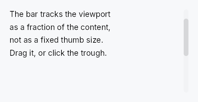
ScrollBar — pointer and keyboard affordance for a ScrollArea.
ScrollBar reads and writes a shared Signal<f32> scroll position and a
Signal<f32> viewport/content ratio, both supplied by its owning ScrollArea.
Interaction (thumb drag, track click, keyboard Up/Down/Home/End, hover) is
handled here; all painting is delegated to the active ScrollBarStyle impl so
the look is fully theme-overridable.
Most applications do not need to construct a ScrollBar directly — ScrollArea
creates and manages the bars automatically. Use this type when building a custom
scroll host (e.g. the RichTextEditor manages its own bars to avoid the
wrap/scrollbar circular dependency).
Accessibility
Hidden from AT via set_hidden(). Scroll actions (Up/Down/Left/Right) are
advertised on the parent ScrollView node, not on the bar, so screen readers
navigate the content region directly without stopping on the thumb.
#![allow(unused)]
fn main() {
use teksilo_widgets::scroll_bar::{ScrollBar, ScrollBarOrientation, ScrollBarVariant};
use teksilo_core::signal::Signal;
let position = Signal::new(0.0_f32);
let max_scroll = Signal::new(500.0_f32);
let viewport_ratio = Signal::new(0.4_f32);
let _bar = ScrollBar::new(
    ScrollBarOrientation::Vertical,
    position,
    max_scroll,
    viewport_ratio,
)
.thickness(8.0)
.variant(ScrollBarVariant::Overlay);
}
Builder methods at a glance
thickness, min_thumb_length, step_size, visual, variant, style, thumb_color
API reference
📖 Full rustdoc API for this module
pub struct ScrollBar
A scroll bar that shares reactive scroll-position state with a ScrollArea.
Supports thumb drag, track-click page scroll, and keyboard Up/Down/Left/Right/Home/End navigation. Hidden from AT — see module docs.
#![allow(unused)]
fn main() {
pub struct ScrollBar { /* fields */ }
}
Methods
pub fn new( orientation: ScrollBarOrientation, scroll_position: Signal<f32>, max_scroll: Signal<f32>, viewport_ratio: Signal<f32>, ) -> Self
Create a new ScrollBar with shared state.
scroll_position: sharedSignal<f32>for current scroll offsetmax_scroll: sharedSignal<f32>for maximum scroll offsetviewport_ratio: sharedSignal<f32>for viewport/content ratio (0.0..1.0)
pub fn thickness(mut self, thickness: f32) -> Self
Set the bar thickness (width for vertical, height for horizontal).
pub fn min_thumb_length(mut self, len: f32) -> Self
Set the minimum thumb length in pixels.
pub fn step_size(mut self, step: f32) -> Self
Set the scroll step for keyboard navigation.
pub fn visual(mut self, variant: ScrollBarVariant) -> Self
Set the visual variant. The active ScrollBarStyle picks how
to paint each variant; the IntUI default ships Permanent /
Overlay / Thin out of the box.
pub fn variant(mut self, variant: ScrollBarVariant) -> Self
Alias for visual using the new variant naming.
pub fn style(mut self, style: impl ScrollBarStyle) -> Self
Override the active ScrollBarStyle for this widget instance only.
pub fn thumb_color(mut self, color: impl Into<ColorProp>) -> Self
Tint the thumb with an explicit colour instead of the theme's
scrollbar_thumb* tokens. Accepts anything impl Into<ColorProp> —
a Color, a theme role (TextRole/SurfaceRole/…), or a Signal;
resolved against the live theme at paint, so roles and signals stay
reactive. The active ScrollBarStyle derives the idle/hover/pressed
states from this tint. Use when the bar sits on a surface the
surface-relative tokens don't suit — a tooltip's inverse chip, a
branded panel. Mirrors Button::text_role.