RadioTileGroup
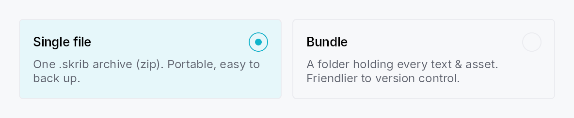
RadioTileGroup — an N-ary group of RadioTiles with single selection.
Like SegmentedControl, the
tile count is not fixed: add any number of tiles, all sharing one
Signal<usize>. The group owns:
- Layout — an equal-size
TileLayout::Row, an adaptive wrappingTileLayout::Grid, a full-widthTileLayout::Column, or a compact fixed-heightTileLayout::Verticalsettings list. Row and Grid equalize tile size (uniform width + the tallest tile's height) via a customplace_childrenmeasuring each tile height-for-width — stacks have no cross-axis stretch, so the group does the sizing. - Keyboard — the WAI-ARIA roving radiogroup pattern: the group is a
single Tab stop; Arrow keys move selection (selection follows focus),
Home/End jump, disabled tiles are skipped.
Increment/DecrementAT actions mirror the arrows for switch access. - Accessibility —
Role::RadioGroupwithactive_descendantpointing at the selected tile; each tile isRole::RadioButtonand declares its siblings viapush_to_radio_group(for "N of M").
let selected = ctx.signal(0_usize);
RadioTileGroup::new(selected)
    .label(tr!(project_format()))
    .tile(RadioTile::new().icon(a).title(tr!(single_file())).description(tr!(single_file_desc())))
    .tile(RadioTile::new().icon(b).title(tr!(bundle())).description(tr!(bundle_desc())))
    .layout(TileLayout::Row)
Builder methods at a glance
label, tile, tiles, layout, spacing, line_spacing, row_height, enabled, style
API reference
📖 Full rustdoc API for this module
pub enum TileLayout
How a RadioTileGroup arranges its tiles.
#![allow(unused)]
fn main() {
pub enum TileLayout { /* variants */ }
}
Variants
Row— A single horizontal row of equal-width, equal-height tiles (the tiles stretch to the tallest). The reference "two cards side-by-side" layout.Grid— A wrapping grid whose column count adapts to the available width:cols = floor((width + spacing) / (min_tile_width + spacing)), at least one. All cells share the same width and the tallest tile's height.Column— A vertical column of full-width tiles, each its natural height. Tiles keep their full card content (icon + title + description).Vertical— A vertical list of compact fixed-height full-width rows:[radio] [icon] [title] [Spacer] [trailing], no description — the settings-list look. Every row is a fixed height taken from the activeRadioTileStyle(the theme'sRadioTileRecipe::vertical_row_height, 44 dp by default; override per-group withRadioTileGroup::row_height), and the group switches each tile to the compact arrangement (leading radio) automatically.
pub struct RadioTileGroup
An N-ary, single-selection group of selectable-card radios. See the
module docs.
#![allow(unused)]
fn main() {
pub struct RadioTileGroup { /* fields */ }
}
Methods
pub fn new(selected: Signal<usize>) -> Self
Create a group bound to the shared selection signal. Add tiles with
tile / tiles.
pub fn label(mut self, label: impl Into<LocalizedString>) -> Self
Accessible name for the group (announced before individual tiles).
pub fn tile(mut self, tile: RadioTile) -> Self
Add a tile. Its value (position) and shared selection signal are
assigned automatically.
pub fn tiles(mut self, tiles: impl IntoIterator<Item = RadioTile>) -> Self
Add several tiles from an iterator.
pub fn layout(mut self, layout: TileLayout) -> Self
Choose the layout (default TileLayout::Row).
pub fn spacing(mut self, spacing: f32) -> Self
Override the gap between tiles along the main axis (and grid columns).
Defaults to 6 dp for TileLayout::Vertical, 12 dp otherwise.
pub fn line_spacing(mut self, spacing: f32) -> Self
Gap between rows in TileLayout::Grid.
pub fn row_height(mut self, height: f32) -> Self
Override the fixed row height for TileLayout::Vertical compact rows.
Takes precedence over the theme value
(RadioTileRecipe::vertical_row_height, 44 dp by default). No effect on
other layouts.
pub fn enabled(mut self, enabled: impl Into<Prop<bool>>) -> Self
Set the enabled state for the whole group, statically or reactively.
pub fn style(mut self, style: impl teksilo_core::styles::RadioTileStyle) -> Self
Forward a RadioTileStyle to every tile that doesn't set its own
.style(...).