RadioButton
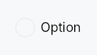
RadioButton — mutually exclusive selection control.
Multiple RadioButtons share a Signal<usize>; selecting one writes its
value to the signal, which automatically deselects every sibling that
observes the same signal. The widget is non-generic: values are usize
indices into the caller's choice list. Wrap related buttons in a
RadioGroup to provide the AT "2 of 3"
positional announcement required by ARIA.
Accessibility
Reports Role::RadioButton with set_toggled mirroring the selected
state. Responds to Action::Click from assistive technology. The focus
ring is keyboard-only (:focus-visible gated by the input-modality
signal). When wrapped in RadioGroup, each button emits
push_to_radio_group([sibling_ids]) so screen readers can announce
positional membership.
#![allow(unused)]
fn main() {
use teksilo_widgets::RadioButton;
use teksilo_core::signal::Signal;
use teksilo_i18n::lit;
let selected = Signal::new(0_usize);
let _r0 = RadioButton::new(0, selected.clone()).label(lit!("Light"));
let _r1 = RadioButton::new(1, selected.clone()).label(lit!("Dark"));
let _r2 = RadioButton::new(2, selected.clone()).label(lit!("System"));
}
Builder methods at a glance
label, caption, enabled, variant, style, tooltip, rich_tooltip, rich_tooltip_content, composite_tooltip
API reference
📖 Full rustdoc API for this module
pub struct RadioButton
A single radio button option that writes value into a shared Signal<usize> on selection.
#![allow(unused)]
fn main() {
pub struct RadioButton { /* fields */ }
}
Methods
pub fn new(value: usize, selected: Signal<usize>) -> Self
Create a radio button with the given value and shared selection signal.
pub fn label(mut self, label: impl Into<LocalizedString>) -> Self
Set the visible label text displayed to the right of the radio circle.
pub fn caption(mut self, text: impl Into<LocalizedString>) -> Self
Secondary explanatory text rendered below the label, left-aligned
with the label (not the radio circle). Uses the small /
text_secondary style. Has no effect unless label(...) is also set.
pub fn enabled(mut self, enabled: impl Into<Prop<bool>>) -> Self
Set the enabled state, statically or reactively. Forwarded to
the arena via ctx.enabled_when(self_id, self.enabled.clone())
at build time.
pub fn variant(mut self, variant: RadioVariant) -> Self
Pick the design-language variant. Default Circle. The active
RadioStyle impl decides what the variant means visually.
pub fn style(mut self, style: impl teksilo_core::styles::RadioStyle) -> Self
Per-call style override. Replaces the theme-wide default
RadioStyle for just this RadioButton instance.
pub fn tooltip(mut self, text: impl Into<LocalizedString>) -> Self
Attach a plain single-line tooltip shown on hover.
pub fn rich_tooltip(mut self, key: impl Into<String>) -> Self
Attach a rich tooltip resolved from the app-wide tooltip
registry. See Button::rich_tooltip.
pub fn rich_tooltip_content(mut self, content: crate::tooltip::TooltipContent) -> Self
Attach a rich tooltip driven by inline TooltipContent.
pub fn composite_tooltip( mut self, content: impl teksilo_core::widget::Widget + 'static, ) -> Self
Attach a composite tooltip — third tier, hosting an arbitrary
widget tree. See Button::composite_tooltip.