MessageBox
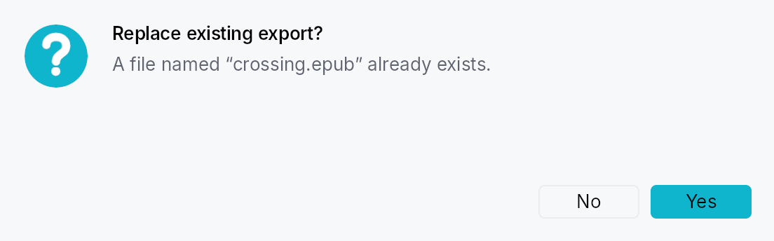
MessageBox — QMessageBox-style alert dialog.
A higher-level surface built on top of ModalContainer
for the classic "tell the user something and ask for a response"
pattern: unsaved-changes prompts, error surfaces, confirmation
dialogs, and informational notices. Mirrors QMessageBox (Qt),
NSAlert (AppKit), and SwiftUI's .alert(...) while staying inside
Teksilo's idioms — closure result handlers, Signal/Prop
reactivity, Intent/Action/Shortcut routing for keyboard
defaults, and AccessKit Role::AlertDialog accessibility.
Quick tour
use teksilo::prelude::*;
use teksilo::widgets::{MessageBox, MessageBoxButtons, StandardButton};

fn on_close(ctx: &mut EventContext) {
    MessageBox::question(lit!("Save changes?"))
        .text(lit!("You have unsaved changes in report.skrib."))
        .informative_text(lit!("Your changes will be lost if you don't save them."))
        .buttons(MessageBoxButtons::SaveDiscardCancel)
        .default_button(StandardButton::Save)
        .escape_button(StandardButton::Cancel)
        .on_result(|r, ctx| match r.button {
            StandardButton::Save => save_and_close(ctx),
            StandardButton::Discard => close(ctx),
            _ => {}
        })
        .present(ctx);
}
# fn save_and_close(_: &mut EventContext) {}
# fn close(_: &mut EventContext) {}
Severity
MessageBoxSeverity controls the icon drawn beside the title and
its tint:
Information— info glyph,status_info_fgtint.Question— question mark glyph,accenttint.Warning— exclamation triangle,status_warning_fgtint.Critical— X-mark circle,status_error_fgtint. Also disables click-outside dismissal (Qt convention).None— no icon, no tint.
Severity is conveyed through the icon + title + text. Per Teksilo's
Int UI baseline, buttons are never colored as "destructive":
destructive intent lives in the dialog's severity and wording, not
in the button. See crate::button for details.
Default & escape buttons
default_button— activated by Enter (widget-scoped shortcut) and receives initial focus on open (viaModalRequest::focus_targetplusWidget::initial_focus_hint). Styled withButtonVariant::Filled.escape_button— activated by Escape. The fallback logic (for presets with no explicitescape_button) picks: explicitescape_button→ firstReject-role button →Cancel→ last button.
Result reporting
MessageBox::on_result takes impl Fn(MessageBoxResult, &mut EventContext) + 'static. The callback fires exactly once — on
button activation or Escape dismissal — then the modal is closed by
the framework.
Accessibility
The widget exposes Role::AlertDialog (distinct from
ModalContainer's Role::Dialog), with set_modal(),
set_live(Live::Assertive), set_name(title), and
set_description(text + informative_text) so screen readers
announce the dialog and its body on open.
Builder methods at a glance
information, warning, critical, question, plain, text, informative_text, detailed_text, buttons, add_button, default_button, escape_button, show_again_checkbox, show_again_checkbox_state, on_result, present
API reference
📖 Full rustdoc API for this module
pub enum MessageBoxSeverity
Alert severity level. Drives the icon glyph + tint shown beside the
title, and (for Critical) whether click-outside dismiss is enabled.
#![allow(unused)]
fn main() {
pub enum MessageBoxSeverity { /* variants */ }
}
Variants
None— No icon. Use for plain notices where an icon would be noise.Information— Informational notice — blue circle with "i" glyph.Question— Confirmation prompt — accent-tinted circle with "?" glyph.Warning— Non-fatal warning — amber triangle with "!" glyph.Critical— Critical error — red circle with an "X" glyph. Click-outside dismissal is disabled (Escape still works).
pub enum ButtonRole
Semantic role of a message-box button. Used for fallback escape
resolution (Reject wins when no explicit escape button is set).
Teksilo deliberately does not render Destructive buttons with
a red fill — the dialog's severity icon and wording carry that
signal. See crate::button for the framework-level rationale.
#![allow(unused)]
fn main() {
pub enum ButtonRole { /* variants */ }
}
Variants
Accept— Confirms / proceeds. Ok, Yes, Save, Open, Apply, Retry.Reject— Bails out. Cancel, Close, No, Abort.Destructive— Data-loss action. Discard. (Same visuals as Regular — the severity of the surrounding MessageBox carries the warning.)Action— Side action. Help, Reset, RestoreDefaults, Ignore, and the "to all" variants.
pub enum StandardButton
The Qt-modeled catalog of standard buttons. Each variant resolves
to a localized label, a semantic ButtonRole, and a stable
intent-name string used internally for shortcut/action routing.
#![allow(unused)]
fn main() {
pub enum StandardButton { /* variants */ }
}
Variants
Ok— Accept / confirm.ButtonRole::Accept.Cancel— Cancel the operation.ButtonRole::Reject.Close— Close the dialog.ButtonRole::Reject.Yes— Confirm with "Yes".ButtonRole::Accept.No— Decline with "No".ButtonRole::Reject.YesToAll— Confirm all remaining items.ButtonRole::Accept.NoToAll— Decline all remaining items.ButtonRole::Reject.Save— Save changes.ButtonRole::Accept.SaveAll— Save all open items.ButtonRole::Accept.Discard— Discard changes without saving.ButtonRole::Destructive.Apply— Apply changes without closing.ButtonRole::Accept.Reset— Reset to defaults.ButtonRole::Action.RestoreDefaults— Restore factory defaults.ButtonRole::Action.Abort— Abort the current operation.ButtonRole::Reject.Retry— Retry the failed operation.ButtonRole::Accept.Ignore— Ignore the error and continue.ButtonRole::Action.Open— Open a file or resource.ButtonRole::Accept.Help— Show help.ButtonRole::Action.
Methods
pub fn role(self) -> ButtonRole
The button's semantic role — used internally by MessageBox's
escape-button fallback resolution, and available to callers that
want to inspect a MessageBoxButton's role.
pub fn intent_name(self) -> &'static str
Stable string id used as both the shortcut id and the intent name for routing default/escape key activations. Scoped to a MessageBox instance via widget-scoped shortcut registration, so the same id is safe to reuse across instances.
pub fn default_label(self) -> LocalizedString
Default label for the button. Resolved through the Fluent
catalog via tr_widget! so apps can override per-locale.
pub struct MessageBoxButton
A single button placement inside a MessageBox, including an optional
per-instance label override. Callers usually build these via
From<StandardButton> (StandardButton::Ok.into()), or
construct them manually when Custom is needed.
#![allow(unused)]
fn main() {
pub struct MessageBoxButton { /* fields */ }
}
Methods
pub fn standard(kind: StandardButton) -> Self
Build a button from a StandardButton with the default label.
pub fn label(mut self, label: impl Into<LocalizedString>) -> Self
Override the default translated label.
pub enum MessageBoxButtons
Pre-built button bundles covering the common MessageBox shapes.
Custom combinations go through MessageBox::add_button or
MessageBoxButtons::Custom.
#![allow(unused)]
fn main() {
pub enum MessageBoxButtons { /* variants */ }
}
Variants
Ok— Just Ok.OkCancel— Ok + Cancel, Ok default, Cancel escape.YesNo— Yes + No, Yes default, No escape.YesNoCancel— Yes + No + Cancel, Yes default, Cancel escape.SaveDiscardCancel— The unsaved-changes triad: Save + Discard + Cancel.RetryIgnoreAbort— The error-recovery triad: Retry + Ignore + Abort.Custom— Explicit list. MessageBox preserves the order as the visual button order (leading Spacer pushes all buttons to the trailing edge; default button may appear anywhere).
pub struct MessageBoxResult
Report passed to MessageBox::on_result when the dialog closes.
#![allow(unused)]
fn main() {
pub struct MessageBoxResult { /* fields */ }
}
pub struct MessageBox
A modal alert dialog that displays a severity icon, title, body text, and one or more buttons.
Constructed via severity-named constructors (MessageBox::information,
MessageBox::warning, MessageBox::critical, MessageBox::question,
MessageBox::plain), configured fluently, and presented with
MessageBox::present. See the module documentation for the full guide.
#![allow(unused)]
fn main() {
pub struct MessageBox { /* fields */ }
}
Methods
pub fn information(title: impl Into<LocalizedString>) -> Self
Construct an informational MessageBox (Information severity).
pub fn warning(title: impl Into<LocalizedString>) -> Self
Construct a warning MessageBox (Warning severity).
pub fn critical(title: impl Into<LocalizedString>) -> Self
Construct a critical-error MessageBox (Critical severity).
Click-outside dismissal is disabled; use an explicit button or
Escape to close.
pub fn question(title: impl Into<LocalizedString>) -> Self
Construct a confirmation / question MessageBox (Question
severity).
pub fn plain(title: impl Into<LocalizedString>) -> Self
Construct a plain MessageBox with no severity icon.
pub fn text(mut self, text: impl Into<LocalizedString>) -> Self
Primary message line, rendered in typography.body with
text_primary. Prefer a short, self-contained sentence —
details belong in informative_text.
pub fn informative_text(mut self, text: impl Into<LocalizedString>) -> Self
Secondary, explanatory text rendered below the primary text in
typography.body with text_secondary. Matches Qt's
setInformativeText.
pub fn detailed_text(mut self, text: impl Into<LocalizedString>) -> Self
Detailed text hidden behind a "Show details" Accordion —
for technical diagnostics (stack traces, error codes). Matches
Qt's setDetailedText.
pub fn buttons(mut self, preset: MessageBoxButtons) -> Self
Apply a preset button bundle. Implicitly sets default and
escape buttons for the preset (both can be overridden via
MessageBox::default_button and
MessageBox::escape_button).
pub fn add_button(mut self, button: impl Into<MessageBoxButton>) -> Self
Append a single button. Use to augment a preset (rare) or to
build a bespoke button row without going through
MessageBoxButtons::Custom.
pub fn default_button(mut self, which: StandardButton) -> Self
Mark which button activates on Enter and receives initial
focus. Must refer to one of the buttons configured via
buttons / add_button.
pub fn escape_button(mut self, which: StandardButton) -> Self
Mark which button activates on Escape (and scrim-click, when allowed). Must refer to one of the configured buttons.
pub fn show_again_checkbox(mut self, label: impl Into<LocalizedString>) -> Self
Attach a "Don't show again"-style checkbox below the body.
Internally creates a Signal<bool> initialized to false and
reports its state in MessageBoxResult::checkbox_checked.
For external observation, use
MessageBox::show_again_checkbox_state instead.
pub fn show_again_checkbox_state(mut self, signal: Signal<bool>) -> Self
Like MessageBox::show_again_checkbox, but with a
caller-owned Signal<bool> so the checkbox state survives the
dialog lifetime (useful for "remember my choice" persistence).
pub fn on_result(mut self, f: impl Fn(MessageBoxResult, &mut EventContext) + 'static) -> Self
Register the result callback, invoked exactly once when a button fires (either by click or by Enter/Escape shortcut).
pub fn present(self, ctx: &mut EventContext)
Present the MessageBox as a modal on top of ctx's current
tree. Consumes self; callers who need to present multiple
dialogs with shared config should build a factory closure.