MenuList
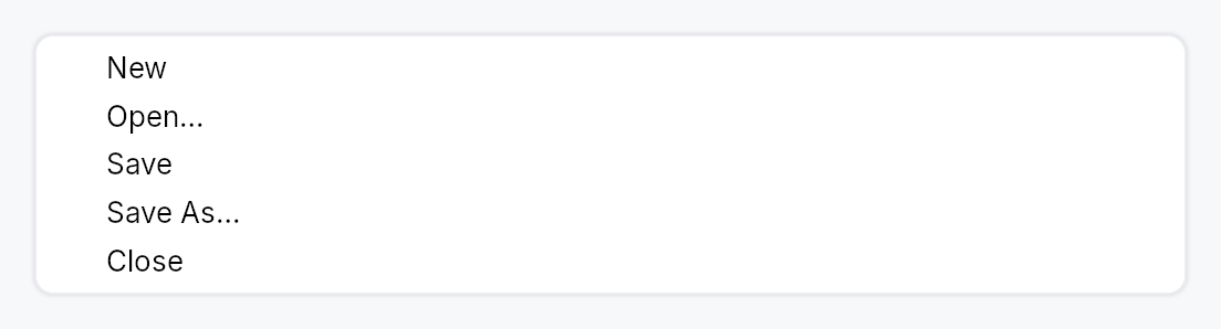
MenuList — a themed vertical menu container with keyboard navigation.
MenuList is the dropdown panel used by MenuBar, MenuContext, and
popover-style menus. It provides a themed surface (background, rounded
border, drop shadow) and owns the full keyboard navigation stack:
ArrowUp/Down moves focus, Enter activates, Escape bubbles to the
enclosing overlay host, Home and End jump to the first/last enabled item.
Type-ahead search jumps to the next item whose stripped label starts with
the accumulated keystrokes (500 ms reset window by default).
Items are added with .item(widget) (any impl Widget, but typically a
MenuItem); separators with .separator(). Conditional rows use
.item_when(widget, visible_prop) — a hidden row collapses to zero height
and is skipped by keyboard navigation. For very long lists (recent files,
etc.) call .max_visible_items(n) to cap the panel height and wrap the
content in a ScrollArea.
Safe-triangle hover gate. When a submenu item opens its child overlay,
MenuList stamps a shared anchor so sibling items can skip their
hover-switch while the cursor travels diagonally toward the submenu.
Accessibility
Role::Menu; each row is Role::MenuItem / Role::MenuItemCheckBox /
Role::MenuItemRadio as declared by the item. Radio items in the same
list auto-group via push_to_radio_group so AT announces "2 of 3".
#![allow(unused)]
fn main() {
use teksilo_widgets::{MenuList, MenuItem};
use teksilo_i18n::lit;
use teksilo_core::Intent;
let _w = MenuList::new()
    .item(MenuItem::new(lit!("Cut")).on_activate_fn(|ctx| ctx.send_intent(Intent::new("app.cut"))))
    .item(MenuItem::new(lit!("Copy")).on_activate_fn(|ctx| ctx.send_intent(Intent::new("app.copy"))))
    .separator()
    .item(MenuItem::new(lit!("Paste")).on_activate_fn(|ctx| ctx.send_intent(Intent::new("app.paste"))));
}
Builder methods at a glance
type_ahead_timeout, attached_side, item, item_when, item_boxed_when, separator, header, max_visible_items
API reference
📖 Full rustdoc API for this module
pub struct MenuSeparator
A 1 dp horizontal divider line between groups of menu items.
#![allow(unused)]
fn main() {
pub struct MenuSeparator;
}
pub struct MenuList
A themed vertical dropdown menu panel with keyboard navigation and type-ahead.
See the module documentation for the full feature description.
#![allow(unused)]
fn main() {
pub struct MenuList { /* fields */ }
}
Methods
pub fn new() -> Self
Create an empty menu list with no items, no height cap, and the default 500 ms type-ahead reset window.
pub fn type_ahead_timeout(mut self, d: Duration) -> Self
Override the type-ahead buffer reset window. Defaults to 500ms
to match Windows' menubar convention. Tests use
Duration::ZERO to force every keypress to start a fresh
search.
pub fn attached_side(mut self, side: crate::shadow::AttachedSide) -> Self
Suppress drop-shadow drawing on the side that visually merges
with the menu's trigger. See crate::shadow::AttachedSide
for the available edges.
pub fn item(mut self, widget: impl Widget + 'static) -> Self
Add a menu item (typically a MenuItem).
pub fn item_when( self, widget: impl Widget + 'static, visible: impl Into<teksilo_core::signal::Prop<bool>>, ) -> Self
Add a menu item that is shown only while visible is true. When the
gate is false the row collapses to zero height (no gap) and keyboard
navigation skips it — arrows, Home/End, Enter, type-ahead, and
mnemonic activation all ignore it. Used e.g. by a Toolbar's overflow
menu, where each row is present only while its inline twin is collapsed.
Because a hidden row never claims its mnemonic letter, two gated rows that are mutually exclusive may share one — the letter resolves to whichever is visible when it is pressed.
pub fn item_boxed_when( mut self, widget: Box<dyn Widget>, visible: impl Into<teksilo_core::signal::Prop<bool>>, ) -> Self
item_when for an already-boxed widget — used when
the row type is decided at runtime (e.g. a menu row that is either a
MenuItem or an embedded control).
pub fn separator(mut self) -> Self
Add a separator line.
pub fn header(mut self, widget: impl Widget + 'static) -> Self
Add a non-interactive section caption (typically a crate::GroupHeader).
Skipped by Arrow/Home/End navigation and type-ahead, exactly like
separator. The caller passes any impl Widget, but it
must expose its own accessible name/role via accessibility() (as
GroupHeader does) or it is silently pruned from the AT tree as a
content-free container.
pub fn max_visible_items(mut self, n: usize) -> Self
Cap the panel height to roughly n * item_height and make the
content scrollable when that height is exceeded. Clamped to at
least 1. Useful for long menus (e.g. a "Recent files" list) —
without this, a very long menu grows to exceed the window.
Note: items are still materialized eagerly; this is a viewport cap, not virtualization. See the module-level note.