MenuItem
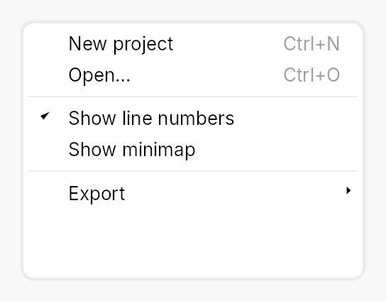
MenuItem — a single command row in a menu or context menu.
Each item consists of an optional leading icon, a label, an optional
trailing shortcut label, and an activation closure. MenuItem is
non-generic: actions are type-erased closures identical to Button's
on_activate_fn model. Submenus are declared with MenuItem::submenu
— the factory builds the nested MenuList lazily at hover time.
Every item operates in one of three modes selected by builder methods:
| Builder | AT Role | Leading glyph |
|---|---|---|
| (default) | Role::MenuItem | icon or blank |
.checked(signal) | Role::MenuItemCheckBox | checkmark / blank |
.check_state(signal) | Role::MenuItemCheckBox | check / dash / blank |
.reflect_checked(signal) | Role::MenuItemCheckBox | checkmark (read-only) |
.radio(value, selected) | Role::MenuItemRadio | filled dot / blank |
Check and radio modes are mutually exclusive with .icon(...) — the
Windows convention reserves the leading slot for state glyphs on
checkable items; a debug_assert! fires when both are set.
An icon that keeps its own colour
.icon(...) recolours whatever it is handed with the row's text role, so the
glyph follows hover, press and disabled alongside the label. That is right for
an icon that says the same thing as the label, and wrong for one whose colour
is the content — a tag's swatch, a status light, a colour a person chose.
.icon_keeps_color() leaves it alone. Two costs come with it: the icon no
longer follows the highlight (on a style whose highlighted row is a solid
accent fill, it has to carry its own contrast against that fill), and a
literal colour does not dim in a disabled row — ColorProp::Static and
Bound ignore the enabled state, while every role variant substitutes its
disabled counterpart. An icon that should dim wants a role, and then it does
not want this at all.
#![allow(unused)]
fn main() {
use teksilo_widgets::{MenuItem, primitives::IconWidget};
use teksilo_canvas::{Path, Point};
use teksilo_i18n::lit;
use teksilo_tokens::Color;
let swatch = IconWidget::from_path(Path::circle(Point::new(5.0, 5.0), 4.5), 10.0)
    .color(Color::from_hex("#e91e63"));
let _w = MenuItem::new(lit!("Characters"))
    .icon(swatch)
    .icon_keeps_color();
}
Mnemonic markers use the in-string & convention (&Save →
underline 'S' when Alt is held; && → literal &). The enclosing
MenuList wires bare-letter in-menu activation automatically.
#![allow(unused)]
fn main() {
use teksilo_widgets::MenuItem;
use teksilo_i18n::lit;
use teksilo_core::Intent;
let _w = MenuItem::new(lit!("&Save"))
    .on_activate_fn(|ctx| ctx.send_intent(Intent::new("app.save")));
}
Builder methods at a glance
on_activate_fn, label, label_localized, action, icon, icon_keeps_color, shortcut_label, trailing_hint, for_shortcut, enabled, style, text_style, text_role, tooltip, rich_tooltip, rich_tooltip_content, composite_tooltip, submenu, submenu_delay, is_submenu, checked, reflect_checked, check_state, radio
API reference
📖 Full rustdoc API for this module
pub struct MenuItem
A single command row in a MenuList or context menu.
See the module documentation for the full mode table, mnemonic syntax, and submenu construction pattern.
#![allow(unused)]
fn main() {
pub struct MenuItem { /* fields */ }
}
Methods
pub fn new(label: impl Into<LocalizedString>) -> Self
Create a plain menu item with the given label and no action yet.
pub fn on_activate_fn(mut self, f: impl Fn(&mut EventContext) + 'static) -> Self
Closure invoked on activation. Note: shortcut label auto-lookup is not available with this variant since there is no typed command to look up.
pub fn label(&self) -> String
Read the item's display label. Exposed so SplitButton (and any other compound widget that embeds a MenuItem) can mirror the label in its own chrome.
pub fn label_localized(&self) -> LocalizedString
Like label but returns the unresolved
LocalizedString, so embedders can mirror the label reactively
(re-resolving on a locale switch) instead of freezing a snapshot.
pub fn action(&self) -> Option<Rc<dyn Fn(&mut EventContext)>>
Clone out a shared handle to the activation closure. Returns None
when this MenuItem has no action (e.g. it's a submenu trigger). The
returned Rc aliases MenuItem's own internal handle — invoking it
has the same effect as the user clicking this menu item (minus the
overlay dismissal that the tap handler also performs).
pub fn icon(mut self, icon: IconWidget) -> Self
Set a leading icon.
pub fn icon_keeps_color(mut self) -> Self
Keep the icon's own colour rather than tinting it with the row's.
A menu icon normally says the same thing as the label beside it, so it takes
the row's text role and follows it through hover, press and disabled — which
is why icon recolours whatever it is handed. Some icons are
not that. A tag's swatch, a status light, a colour a person chose: there the
colour is the content, and tinting it to the menu's foreground deletes the
only thing the icon was there to say.
Opt-in, because the default is right for nearly every row, and keeping a colour has two costs the caller takes on:
- It does not follow the highlight. On a style whose highlighted row is a solid accent fill (the macOS recipe), the icon has to carry its own contrast against that fill as well as against the menu's surface.
- It does not dim when the row is disabled — if it is a literal colour.
That is
ColorProp's own rule everywhere, not a special case here:StaticandBoundignore the enabled state, while every role variant substitutes its disabled counterpart. An icon that should dim should be given a role instead, and then it does not need this at all.
Ignored in the check and radio modes, which draw an indicator glyph of the framework's own rather than the caller's icon.
pub fn shortcut_label(mut self, label: impl Into<String>) -> Self
Set a trailing shortcut label (e.g., "Ctrl+X"). Shortcut labels are typically not translated (they're the key combination literal), so this accepts a plain string.
pub fn trailing_hint(mut self, text: impl Into<LocalizedString>) -> Self
Set a trailing descriptive hint (e.g. "inside", "after parent") — a secondary phrase explaining what the item will do, rendered in the same trailing slot as an accelerator but semantically unrelated to one.
Prefer this over shortcut_label for any
trailing text that is not a key combination. It differs in two ways
that matter:
- it takes a
LocalizedString, so atr!(...)hint re-resolves on a live locale change instead of being frozen at build time; - it is announced as the item's accessible description, not as
keyboard_shortcut— a screen reader would otherwise read the phrase out as if it were a chord to press.
Independent of the accelerator: an item may carry both, in which case the chord renders first and the hint follows it.
pub fn for_shortcut(mut self, id: &'static str) -> Self
Bind the trailing shortcut label to a registered
Shortcut by its stable id.
At build time the effective primary keystroke is rendered;
rebinds performed through
ShortcutRegistry
rebuild this item automatically via the registry's version
signal.
A manual shortcut_label takes
precedence when both are set.
pub fn enabled(mut self, enabled: impl Into<Prop<bool>>) -> Self
Set the enabled state — static or signal-bound. A bound Signal<bool>
enables/disables the item reactively (paint and AT follow), so
MenuItem::new(...).enabled(can_save_signal) greys out live without a
rebuild. Cursor is always Pointer (see build); disabled items are
gated by the arena before hover runs, so a NotAllowed cursor cannot
be applied from a build-time snapshot of this prop either.
pub fn style(mut self, style: impl teksilo_core::styles::MenuItemStyle) -> Self
Per-call style override. Replaces the theme-wide default
MenuItemStyle for just this MenuItem instance.
pub fn text_style(mut self, style: impl Into<teksilo_core::color_prop::TextStyleProp>) -> Self
Override the label's text style (font, size, weight). Accepts a
TextStyleRole, a TextStyle, or a Signal of either. Default
(unset) is TextStyleRole::Body.
pub fn text_role(mut self, color: impl Into<teksilo_core::color_prop::ColorProp>) -> Self
Override the label text color. Accepts Color, a role, or a
Signal of either. Default (unset) is the interaction/enabled
cascade; setting this replaces that cascade (the hover / disabled
tint no longer applies), so reserve it for chrome that enforces a
fixed text role.
pub fn tooltip(mut self, text: impl Into<LocalizedString>) -> Self
Attach a tooltip that appears after a hover delay, same mechanism
as Button::tooltip.
pub fn rich_tooltip(mut self, key: impl Into<String>) -> Self
Attach a rich tooltip resolved from the app-wide tooltip
registry. Body text supports inline markup
(label, *italic*, **bold**); the entry's shortcut
and long-form "more" fields are rendered automatically.
pub fn rich_tooltip_content(mut self, content: crate::tooltip::TooltipContent) -> Self
Attach a rich tooltip driven by inline TooltipContent.
pub fn composite_tooltip(mut self, content: impl Widget + 'static) -> Self
Attach a composite tooltip — third tier, hosting an arbitrary
widget tree. See Button::composite_tooltip.
pub fn submenu( label: impl Into<LocalizedString>, factory: impl Fn() -> Box<dyn Widget> + 'static, ) -> Self
Create a submenu trigger item. The factory is invoked during build() to
pre-create the submenu content (typically a MenuList), which is kept
dormant until the hover delay elapses.
pub fn submenu_delay(mut self, delay: Duration) -> Self
Set a custom submenu open delay (default: 200ms).
pub fn is_submenu(&self) -> bool
Whether this is a submenu trigger.
pub fn checked(mut self, state: Signal<bool>) -> Self
Bind this item to a two-state Signal<bool>. The item renders
Role::MenuItemCheckBox; activation flips the signal. By
Windows convention, the leading icon slot becomes a checkmark
when the signal is true, blank otherwise.
Mutually exclusive with check_state
and radio — last call wins.
pub fn reflect_checked(mut self, state: impl Into<Prop<bool>>) -> Self
Render Role::MenuItemCheckBox whose checkmark reflects state
read-only: activation does NOT write the signal — the truth lives
elsewhere (a model / method), and this item's on_activate/intent is
responsible for the change, after which state updates the checkmark
reactively. Use for "View ▸ Sidebar / Full Screen"-style commands that
mirror externally-owned state (e.g. DockingModel::dock_open_signal),
where two-way checked would fight the model.
Mutually exclusive with the other check / radio binders — last call wins.
pub fn check_state(mut self, state: Signal<CheckState>) -> Self
Bind this item to a tri-state Signal<CheckState>. The item
renders Role::MenuItemCheckBox; activation cycles
Unchecked ↔ Checked (per Windows / Checkbox
convention: Indeterminate is reserved for external sources
like TreeCheckedModel; clicking from Indeterminate
promotes to Checked).
The leading-slot glyph is checkmark for Checked, dash
for Indeterminate, blank for Unchecked — matching the
Windows mixed-state convention.
Mutually exclusive with checked
and radio — last call wins.
pub fn radio(mut self, value: usize, selected: Signal<usize>) -> Self
Bind this item to a radio group via a shared Signal<usize>.
Activation writes value into selected; all radio items
sharing the same selected signal observe the change and
update their leading-slot dot accordingly. The item renders
Role::MenuItemRadio.
For "2 of 3"-style AT announcement, the enclosing
MenuList groups radio items
by selection-signal identity and emits push_to_radio_group
relationships automatically — no app-side wiring required.
Mutually exclusive with checked
and check_state — last call
wins.