GroupBox
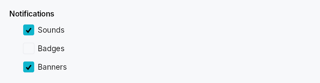
GroupBox — titled cluster of controls in Int UI / Jewel style.
A bold title (optionally preceded by a checkbox) sits above an indented content area. No border, no frame — pure composition. The standard use is grouping related settings controls on a preferences sheet or form — the IntelliJ "group" pattern.
In checkable mode, unchecking disables event dispatch to every descendant
of the content area (via ctx.enabled_when with ancestor propagation) AND
paints a translucent surface overlay over the content so it reads as
greyed-out. The title checkbox itself stays interactive.
When to use
- GroupBox — logical cluster with a title; optional enable/disable toggle for the whole cluster. Use for settings sections.
GroupHeader— lighter-weight "soft divider + caption" without a content slot; use to label regions that are not collapsed or disabled as a unit.
Accessibility
The box node carries Role::Group and its name is set to the title
string. When checkable and unchecked, set_disabled() is set on the
group node so assistive technology announces the cluster as unavailable.
#![allow(unused)]
fn main() {
use teksilo_widgets::GroupBox;
use teksilo_widgets::primitives::TextWidget;
use teksilo_i18n::lit;
let _w = GroupBox::new(lit!("Indentation"))
    .child(TextWidget::new(lit!("Tab width: 4")));
}
Builder methods at a glance
checkable, child, child_id
API reference
📖 Full rustdoc API for this module
pub const GROUP_BOX_CONTENT_INDENT
Horizontal indent of the content area below the title (dp).
#![allow(unused)]
fn main() {
pub const GROUP_BOX_CONTENT_INDENT: f32 = 24.0;
}
pub const GROUP_BOX_TITLE_CONTENT_SPACING
Vertical gap between the title row and the content area (dp).
#![allow(unused)]
fn main() {
pub const GROUP_BOX_TITLE_CONTENT_SPACING: f32 = 8.0;
}
pub const GROUP_BOX_CHECKBOX_GAP
Gap between the checkbox and the adjacent title label in checkable mode (dp).
#![allow(unused)]
fn main() {
pub const GROUP_BOX_CHECKBOX_GAP: f32 = 6.0;
}
pub struct GroupBox
A titled cluster of controls with optional enable/disable toggle.
See the module documentation for the checkable-mode details and
the GroupHeader sibling.
#![allow(unused)]
fn main() {
pub struct GroupBox { /* fields */ }
}
Methods
pub fn new(title: impl Into<LocalizedString>) -> Self
Create a non-checkable group box with the given title.
pub fn checkable(mut self, checked: Signal<bool>) -> Self
Turn this into a checkable GroupBox. When the signal is false, events
to descendants of the content area are blocked via effective-enabled
ancestor propagation. The title checkbox itself stays interactive.
pub fn child(mut self, widget: impl Widget + 'static) -> Self
Set the content widget inline (deferred insertion).
pub fn child_id(mut self, id: WidgetId) -> Self
Set the content widget by pre-registered ID.