DateTimeEdit
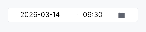
DateTimeEdit — single unified control for picking a DateTime.
Visually one widget: a single bordered frame containing a date
TextInputField half, a small painted separator, a time
TextInputField half, and a trailing built-in calendar button that
opens a Calendar popover anchored below the wrapper. Backed by
Signal<Option<DateTime>>.
┌──────────────────────────────────────┐
│ 05/02/2026   ·   14:35   │ 📅       │
└──────────────────────────────────────┘
Why one frame?
Two adjacent DateEdit + TimeEdit (one frame each) visually read
as two separate fields that happen to be next to each other. A single
frame says "this is one moment in time" — same affordance the user
is used to from booking sites, calendar apps, and form builders.
Behaviour
- Two text halves — date pattern on the left (locale-derived strftime subset), time pattern on the right (24h or 12h, with or without seconds). Each half carries its own input mask, validator, and segment-stepping (Up/Down on the focused segment).
- Painted separator — a thin middle-dot glyph (
·), no text. Visual only; AT users see the wrapper'sRole::DateTimeInput. The separator can be replaced with a custom string viaseparator(rendered as styled secondary text). - One trailing calendar button — Int UI
IconButton::embedded()with the calendar glyph. Opens a single popover hostingCalendar::singlebound to the date half. Picking a cell commits the date and closes the popover; the time half retains whatever the user typed. - One frame — focus-aware border (
BorderRole::Focusedwhile any half holds focus, otherwiseDefault), validation-aware border (ErrorforInvalid,FocusedforCorrected). - One validation strip below the frame — composed feedback from both halves (worse of the two wins).
Accessibility
- Container —
Role::DateTimeInputwithset_valueformatted asYYYY-MM-DDTHH:MM:SS(ISO 8601 datetime). - Each
TextInputFieldkeeps its ownRole::TextInputAT node; the wrapper'sRole::DateTimeInputprovides the datetime semantics.
// Requires ctx.signal() — shown as ignore per convention.
use teksilo_widgets::date_time_edit::{DateTimeEdit, SecondsMode};

let datetime = ctx.signal(None);
let _w = DateTimeEdit::new(datetime.clone())
    .seconds(SecondsMode::Hidden)
    .on_value_changed(|dt, _ctx| println!("{dt:?}"));
Builder methods at a glance
style, required, date_format_pattern, time_format, seconds, min, max, step_minutes, first_day_of_week, show_calendar_button, separator, placeholder, enabled, read_only, label, validation_behavior, time_width_policy, validation_feedback_signal, on_value_changed, tooltip, rich_tooltip, rich_tooltip_content, composite_tooltip, value
API reference
📖 Full rustdoc API for this module
pub struct DateTimeEdit
Single unified datetime picker over Signal<Option<DateTime>>. See
the module docs for the visual layout and behaviour.
#![allow(unused)]
fn main() {
pub struct DateTimeEdit { /* fields */ }
}
Methods
pub fn new(value: Signal<Option<DateTime>>) -> Self
Create a datetime picker backed by the optional value signal.
pub fn style(mut self, style: impl teksilo_core::styles::DateEditStyle) -> Self
Per-call DateEditStyle override (shared with DateEdit family).
pub fn required(value: Signal<DateTime>) -> Self
Create a datetime picker backed by a required (non-optional) signal.
The widget wraps it in an Option proxy internally and keeps the two
in sync via ctx.effect — the outer signal is never set to None.
pub fn date_format_pattern(mut self, p: impl Into<String>) -> Self
Override the strftime-subset format pattern for the date half
(e.g. "%d/%m/%Y"). Defaults to the locale-derived pattern.
pub fn time_format(mut self, f: TimeFormat) -> Self
Lock the time half to a specific clock (12h or 24h). When this
builder is not called, the time half defaults to the user's
current locale via prefers_12_hour_clock — same rule as
standalone TimeEdit.
pub fn seconds(mut self, mode: SecondsMode) -> Self
Whether the time half includes a seconds field. Defaults to SecondsMode::Hidden.
pub fn min(mut self, dt: DateTime) -> Self
Earliest selectable datetime (inclusive). Both the calendar cell and the text validator enforce this floor.
pub fn max(mut self, dt: DateTime) -> Self
Latest selectable datetime (inclusive). Both the calendar cell and the text validator enforce this ceiling.
pub fn step_minutes(mut self, n: u32) -> Self
Minute increment for Up/Down segment stepping on the minute field.
Defaults to 1; values below 1 are clamped to 1.
pub fn first_day_of_week(mut self, w: Weekday) -> Self
Override which weekday appears in the first column of the calendar popup.
pub fn show_calendar_button(mut self, show: bool) -> Self
Show or hide the trailing calendar button. Default true.
pub fn separator(mut self, s: impl Into<String>) -> Self
Override the painted middle-dot separator with a custom string (rendered as styled secondary text between the two halves). Pass an empty string to suppress the separator entirely.
pub fn placeholder(mut self, text: impl Into<LocalizedString>) -> Self
Placeholder shown when the datetime is None.
pub fn enabled(mut self, enabled: impl Into<Prop<bool>>) -> Self
Set the enabled state, statically or reactively. Forwarded to the arena at build time.
pub fn read_only(mut self, read_only: bool) -> Self
Make both halves read-only; the calendar button is also disabled.
pub fn label(mut self, label: impl Into<LocalizedString>) -> Self
Accessible label for the wrapper Role::DateTimeInput node. When not
set, falls back to the localized date-time-edit-name message.
pub fn validation_behavior(mut self, behavior: ValidationBehavior) -> Self
How parse failures are surfaced. Forwarded to both halves — each half uses the same behaviour.
pub fn time_width_policy(mut self, policy: crate::date_edit::WidthPolicy) -> Self
How the trailing (time) half claims horizontal space. The
leading (date) half always sizes to its natural mask width;
the time half follows this policy. Default
WidthPolicy::Default (natural width); pass
WidthPolicy::Fill to make the time half absorb extra
space the parent offers.
pub fn validation_feedback_signal(&self) -> Signal<ValidationFeedback>
Reactive handle on the composed validation feedback. Reflects
whichever half is more severe (Invalid > Corrected > Valid > Pristine).
pub fn on_value_changed( mut self, f: impl Fn(Option<DateTime>, &mut EventContext) + 'static, ) -> Self
Callback invoked whenever the datetime changes. Receives the new
Option<DateTime> and an EventContext for dispatching intents.
pub fn tooltip(mut self, text: impl Into<LocalizedString>) -> Self
Show a plain single-line tooltip after a hover delay. Mutually
exclusive with rich_tooltip / rich_tooltip_content /
composite_tooltip — each setter clears the other three so the
last call wins.
pub fn rich_tooltip(mut self, key: impl Into<String>) -> Self
Show a rich tooltip identified by a registry key. Mutually
exclusive with tooltip / rich_tooltip_content /
composite_tooltip — each setter clears the other three so the
last call wins.
pub fn rich_tooltip_content(mut self, content: crate::tooltip::TooltipContent) -> Self
Show a rich tooltip with inline content. Mutually exclusive with
tooltip / rich_tooltip / composite_tooltip — each setter
clears the other three so the last call wins.
pub fn composite_tooltip(mut self, content: impl Widget + 'static) -> Self
Show a composite tooltip whose body is an arbitrary widget tree.
Mutually exclusive with tooltip / rich_tooltip /
rich_tooltip_content — each setter clears the other three so
the last call wins.
pub fn value(&self) -> Signal<Option<DateTime>>
Clone the underlying Signal<Option<DateTime>> for external binding.