DateEdit
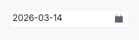
DateEdit — text input + calendar popover, bound to Signal<Option<Date>>.
A single-line editable date field. The underlying surface is a
TextInputField displaying the formatted date; commit on Enter or
blur parses the input against the active pattern, clamps to
[min_date, max_date], and writes the result back. A trailing
calendar-icon button opens a Calendar
popover anchored below the field for graphical date selection.
Behaviour
- Value binding:
Signal<Option<Date>>is the source of truth. External writes re-format the text.Noneshows the placeholder. - Pattern: locale-derived strftime-subset (
%Y-%m-%d,%m/%d/%Y, …); override viaformat_pattern. - Step keys (preview-pass on the field):
- Arrow Up / Down → ±1 day; Shift+ → ±7 days.
- Page Up / Page Down → ±1 month; Shift+ → ±1 year.
Alt+ArrowDown(or click the calendar icon) → opens calendar popover.
- Calendar popover: dismisses on click-outside or Escape,
commits on cell click, animates with
motion.duration_fastfade. - Min / Max: clamps on commit and on step. Out-of-range values in the popover cell are disabled.
Accessibility
- Container —
Role::DateInput,set_valueto ISO selection,set_labelfrom.label()builder,set_placeholderwhen value isNone. - Calendar trigger button —
Role::Buttonwithset_has_popup(HasPopup::Grid)andset_expanded(open). - Internally the editing surface remains a
Role::TextInputfor AT discoverability (so screen readers know it accepts text); the wrapper carries the DateInput role on the outer node.
Example
use teksilo::widgets::{DateEdit, common::datetime::Date};

let date = ctx.signal(Some(Date::constant(2026, 5, 2)));
ctx.add(
    DateEdit::new(date.clone())
        .min_date(Date::constant(2020, 1, 1))
        .max_date(Date::constant(2030, 12, 31))
        .label("Birth date"),
);
Builder methods at a glance
style, required, min_date, max_date, format_pattern, placeholder, first_day_of_week, show_calendar_button, calendar_popover_placement, enabled, read_only, validation_behavior, width_policy, validation_feedback_signal, label, on_value_changed, value, tooltip, rich_tooltip, rich_tooltip_content, composite_tooltip
API reference
📖 Full rustdoc API for this module
pub enum WidthPolicy
How a datetime widget claims horizontal space.
Shared across DateEdit, TimeEdit, DateRangeEdit, and
DateTimeEdit. For the two-half widgets the policy applies to
the trailing half only — the leading half always sizes to its
mask-derived natural width so the date never reflows when only
the time half changes.
#![allow(unused)]
fn main() {
pub enum WidthPolicy { /* variants */ }
}
Variants
Default— Default. The widget claims its natural width: the mask-derived empty template (__/__/____for ISO date,__:__for 24h time) measured in the theme body font plus surrounding chrome. The footprint stays fixed as the user types — Int UI form-density convention. This is theDefault.Fill— The widget expands to fill the horizontal space its parent offers, instead of capping at the natural mask width. Use inside toolbars, inspector panels, or anExpand::horizontalcolumn that should stretch with the surrounding layout.
pub enum ValidationBehavior
How the date editor reacts to out-of-range or partially invalid input.
#![allow(unused)]
fn main() {
pub enum ValidationBehavior { /* variants */ }
}
Variants
AutoCorrect— Out-of-range inputs are clamped to the nearest valid value (e.g.12/50/2026→12/31/2026) and announced viaLive::Polite. Matches macOS Calendar and iOS DatePicker. This is theDefault.Reject— Out-of-range inputs are rejected with an inline error message; the field's text is left as-typed so the user can correct it. The bound value is unchanged until a valid date is committed. Matches Excel / Material strict-validation patterns. Use for high-precision contexts where silently rounding is unacceptable.
pub struct DateEdit
Single-line date input with optional calendar popover. See the
module docs for the full feature list.
#![allow(unused)]
fn main() {
pub struct DateEdit { /* fields */ }
}
Methods
pub fn new(value: Signal<Option<Date>>) -> Self
Construct a date editor bound to a nullable date signal.
pub fn style(mut self, style: impl teksilo_core::styles::DateEditStyle) -> Self
Per-call style override for the date-edit chrome.
pub fn required(value: Signal<Date>) -> Self
Construct from a non-nullable date signal. Internally backed by
a Signal<Option<Date>> proxy that mirrors the source in both
directions. The placeholder is unused — the proxy is always
initialized to Some(value.get()) and the mirror keeps it
non-empty.
pub fn min_date(mut self, d: Date) -> Self
Clamp the selectable range from below. Dates earlier than d
are rejected on commit and are shown as disabled in the calendar popover.
pub fn max_date(mut self, d: Date) -> Self
Clamp the selectable range from above. Dates later than d
are rejected on commit and are shown as disabled in the calendar popover.
pub fn format_pattern(mut self, pat: impl Into<String>) -> Self
Override the locale-derived format pattern (strftime subset, see
crate::common::datetime::pattern).
pub fn placeholder(mut self, text: impl Into<LocalizedString>) -> Self
Text displayed when the bound value is None. Defaults to empty
(no placeholder rendered).
pub fn first_day_of_week(mut self, w: Weekday) -> Self
Override which weekday heads the calendar's column grid. Defaults to the locale's convention if not set.
pub fn show_calendar_button(mut self, show: bool) -> Self
Show or hide the trailing calendar-icon trigger button that opens
the calendar popover. Default true.
pub fn calendar_popover_placement(mut self, p: OverlayPlacement) -> Self
Override where the calendar popover appears relative to the field.
Default is OverlayPlacement::BelowPreferred.
pub fn enabled(mut self, enabled: impl Into<Prop<bool>>) -> Self
Set the enabled state, statically or reactively. Forwarded to the arena at build time.
pub fn read_only(mut self, read_only: bool) -> Self
Make the field read-only: text is selectable and copyable but not editable, and step keys are suppressed.
pub fn validation_behavior(mut self, behavior: ValidationBehavior) -> Self
How parse failures are surfaced. Default
ValidationBehavior::AutoCorrect (clamp + announce); switch
to ValidationBehavior::Reject for strict-validation form
contexts.
pub fn width_policy(mut self, policy: WidthPolicy) -> Self
How the widget claims horizontal space. Default
WidthPolicy::Default — the field sizes to its natural
mask-derived width. Switch to WidthPolicy::Fill to make
the field stretch to fill the parent's offered width
(toolbar / inspector pattern).
pub fn validation_feedback_signal(&self) -> Signal<ValidationFeedback>
Reactive handle on the live validation feedback (mirrored from
the inner field). Composites that want to render their own
feedback UI elsewhere can bind to this; the default
ValidationStrip slot below the field uses it internally.
pub fn label(mut self, label: impl Into<LocalizedString>) -> Self
Set the accessible label for the field (also shown by any paired
FormLayout label slot). Defaults to the localized "Date" string.
pub fn on_value_changed( mut self, f: impl Fn(Option<Date>, &mut EventContext) + 'static, ) -> Self
Register a callback fired on every committed value change with the
new Option<Date> and a live EventContext. Fires only on
user-driven commits (typing + blur, Enter, calendar selection),
not on external writes to the bound signal.
pub fn value(&self) -> Signal<Option<Date>>
Return a clone of the bound value signal for external observation.
pub fn tooltip(mut self, text: impl Into<LocalizedString>) -> Self
Attach a plain single-line tooltip shown after a hover delay.
Mutually exclusive with Self::rich_tooltip,
Self::rich_tooltip_content, and Self::composite_tooltip —
this call clears those slots.
pub fn rich_tooltip(mut self, key: impl Into<String>) -> Self
Attach a rich tooltip looked up by registry key. Mutually exclusive
with Self::tooltip, Self::rich_tooltip_content, and
Self::composite_tooltip — this call clears those slots.
pub fn rich_tooltip_content(mut self, content: crate::tooltip::TooltipContent) -> Self
Attach a rich tooltip from inline content. Mutually exclusive with
Self::tooltip, Self::rich_tooltip, and
Self::composite_tooltip — this call clears those slots.
pub fn composite_tooltip(mut self, content: impl Widget + 'static) -> Self
Attach a composite tooltip whose body is an arbitrary widget tree.
Mutually exclusive with Self::tooltip, Self::rich_tooltip,
and Self::rich_tooltip_content — this call clears those slots.