Checkbox
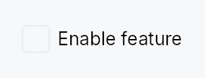
Checkbox — a two-state or tristate checkbox with an optional label.
Checkbox renders a square (or rounded-square / circle) toggle box
alongside an optional label and caption. Two modes are supported:
- Two-state (
Checkbox::new): toggles aSignal<bool>betweentrue(checked) andfalse(unchecked) on click or Space. - Tristate (
Checkbox::tristate): cycles aSignal<CheckState>betweenCheckedandUncheckedon user interaction; theIndeterminatestate is set only by external sources such asTreeCheckedModelaggregation — clicking fromIndeterminategoes toChecked, not a further third state.
Chrome (box shape, fill, focus ring) is driven by the active
CheckboxStyle; three visual variants are available via
CheckboxVariant.
Accessibility
Announces as Role::CheckBox. A label is required in debug builds
unless .labels_hidden(true) is set (for embedding inside a composite
row that owns the AT name). Keyboard: Space toggles; lone-KeyUp guard
prevents spurious toggle when focus is restored after a shortcut.
#![allow(unused)]
fn main() {
use teksilo_widgets::Checkbox;
use teksilo_core::signal::Signal;
use teksilo_i18n::lit;
let checked = Signal::new(false);
let _cb = Checkbox::new(checked)
    .label(lit!("Accept terms and conditions"));
}
Builder methods at a glance
tristate, labels_hidden, label, caption, enabled, variant, style, tooltip, rich_tooltip, rich_tooltip_content, composite_tooltip
API reference
📖 Full rustdoc API for this module
pub struct Checkbox
A checkbox that toggles a Signal<bool> or cycles a Signal<CheckState>.
#![allow(unused)]
fn main() {
pub struct Checkbox { /* fields */ }
}
Methods
pub fn new(checked: Signal<bool>) -> Self
Create a two-state checkbox bound to a Signal<bool>.
pub fn tristate(state: Signal<CheckState>) -> Self
Create a tristate checkbox bound to a Signal<CheckState>.
User clicks toggle Checked ↔ Unchecked (clicking from Indeterminate
checks the whole). The Indeterminate state is reserved for external
sources — TreeCheckedModel aggregation when descendants are mixed,
"select all" indicators, etc. Matches the Outlook / Files-app
folder-checkbox semantic. Useful for parent checkboxes in tree views.
pub fn labels_hidden(mut self, hidden: bool) -> Self
Suppress the visual label/caption AND the debug-time
"missing accessible label" assertion. Use this only when
the checkbox is embedded inside a composite that owns the
row's accessible name (e.g. StandardListItem /
StandardTreeItem, where the row's accessibility(builder)
calls set_name(...) with the row label).
A11y contract: when labels_hidden(true) is set, the
caller MUST guarantee that an addressable AT ancestor
provides the name — either via that ancestor's own
accessibility() impl or a builder-level
.access_label* override. Without it the AT tree exposes a
Role::CheckBox node with no name; screen readers announce
"checkbox, checked" with no context. The Outlook /
Files-app row pattern (where the row label covers the
embedded checkbox) is the supported use case.
pub fn label(mut self, label: impl Into<LocalizedString>) -> Self
Set the visible label rendered to the right of the checkbox box,
also used as the AT name. Required unless .labels_hidden(true) is set.
pub fn caption(mut self, text: impl Into<LocalizedString>) -> Self
Secondary explanatory text rendered below the label, left-aligned
with the label (not the box). Uses the small / text_secondary
style. Has no effect unless label(...) is also set.
pub fn enabled(mut self, enabled: impl Into<Prop<bool>>) -> Self
Set the enabled state, statically or reactively. Forwarded to the
arena via ctx.enabled_when(self_id, self.enabled.clone()) at
build time — a bound Signal<bool> updates live.
pub fn variant(mut self, variant: CheckboxVariant) -> Self
Pick the design-language variant. Default Square. The active
CheckboxStyle impl decides what the variant means visually
(the IntUI RecipeCheckboxStyle honours all three variants
directly via corner-shape changes).
pub fn style(mut self, style: impl teksilo_core::styles::CheckboxStyle) -> Self
Per-call style override. Replaces the theme-wide default
CheckboxStyle for just this Checkbox instance — same role as
Button::style(...).
pub fn tooltip(mut self, text: impl Into<LocalizedString>) -> Self
Attach a plain tooltip shown after a hover delay. Clears any previously set rich or composite tooltip (last-call wins).
pub fn rich_tooltip(mut self, key: impl Into<String>) -> Self
Attach a rich tooltip resolved from the app-wide tooltip
registry. See Button::rich_tooltip.
pub fn rich_tooltip_content(mut self, content: crate::tooltip::TooltipContent) -> Self
Attach a rich tooltip driven by inline TooltipContent.
pub fn composite_tooltip( mut self, content: impl teksilo_core::widget::Widget + 'static, ) -> Self
Attach a composite tooltip — third tier, hosting an arbitrary
widget tree. See Button::composite_tooltip.