Calendar
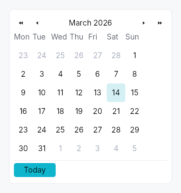
Calendar — month-grid date picker, standalone widget.
A self-contained calendar with month/year navigation, a 6×7 day grid,
keyboard navigation matching the WAI-ARIA grid pattern, and full
AccessKit instrumentation (Role::Grid + per-cell Role::GridCell).
Used standalone for event apps and scheduling, and embedded in
DateEdit's popover.
Selection modes
Calendar::single— pick one day. Bound toSignal<Option<Date>>.Calendar::range— pick a start + end day. Bound toSignal<Option<DateRange>>. Click first day → click second day to commit. Escape mid-selection cancels the in-progress anchor.
Behaviour
- Visible month is independent of the selection — navigating past the selected month doesn't lose the selection.
- Today highlight draws a ring around today's cell whenever it's
in the visible month. Color comes from
TextRole::Accent. - Out-of-month cells (the leading days from the previous month
and trailing days from the next month that fill the 6×7 grid) are
rendered with
TextRole::Disabledand remain selectable (matching macOS / Material). To prevent selection usedisabled_date_filter. - Keyboard (matches the WAI-ARIA
gridpattern):- Arrow keys: move focus by one day.
- Home / End: first / last day of week.
- Ctrl+Home / Ctrl+End: first / last day of month.
- PageUp / PageDown: previous / next month.
- Shift+PageUp / Shift+PageDown: previous / next year.
- Enter / Space: commit focused day to selection.
- Escape: in range mode mid-selection, cancel anchor; otherwise bubble (popover hosts close).
T: jump focus to today.
Accessibility
- Container —
Role::Gridwithset_label("Calendar, May 2026")(localized). Single-mode also setsset_valueto the current ISO selection or empty; range mode sets"start – end". - Header arrow buttons —
Role::Buttonwith localized labels ("Previous month", "Next month") andAction::Clickadvertised. - Header month/year label —
Role::Button(clickable to open the month picker) withset_has_popup(HasPopup::Grid)andset_expanded(open). - Weekday header row —
Role::RowofRole::ColumnHeadercells, each labelled with the long weekday name (e.g. "Monday"). - Day cells —
Role::GridCellwith localized long-form labels ("May 2, 2026"),set_selected,set_focused,set_disabledfor filter rejections, andAction::Clickadvertised.
Example
use teksilo::widgets::{Calendar, common::datetime::Date};

let date = ctx.signal(Some(Date::constant(2026, 5, 2)));
ctx.add(
    Calendar::single(date.clone())
        .show_today_button(true)
        .on_selection_changed(|d, ctx| ctx.send_intent(MyIntent::DateChanged(d))),
);
Builder methods at a glance
single, range, first_day_of_week, week_numbers, show_today_button, show_navigation, min_date, max_date, disabled_date_filter, label, enabled, on_selection_changed, on_range_changed, on_month_changed, on_activate, visible_month_signal, focused_date_signal, mode_signal
API reference
📖 Full rustdoc API for this module
pub struct DateRange
Inclusive range of two dates, with start <= end enforced at
construction. Used by Calendar::range.
#![allow(unused)]
fn main() {
pub struct DateRange { /* fields */ }
}
Methods
pub fn new(a: Date, b: Date) -> Self
Construct a range; swaps start and end if needed so the
invariant start <= end always holds.
pub fn contains(&self, d: Date) -> bool
true iff d is between start and end inclusive.
pub enum CalendarMode
What the calendar body is showing — drives the WPF/Avalonia
"header-zoom" UX where clicking the title cycles to a coarser
grid, letting the user reach any year in 2-3 clicks instead of
many chevron presses. Default CalendarMode::Days.
#![allow(unused)]
fn main() {
pub enum CalendarMode { /* variants */ }
}
Variants
Days— 6×7 day grid for the visible month. Title shows "May 2026". Header chevrons step by ±1 month and ±1 year.Months— 4×3 grid of months. Title shows "2026". Header chevrons step by ±1 year. Picking a cell zooms back intoSelf::Days.Years— 4×3 grid of years (current decade). Title shows "2020 — 2029". Header chevrons step by ±10 years (one decade). Picking a cell zooms back intoSelf::Months.
Methods
pub fn demote(self) -> Self
Mode after demoting one level (clicking the header title).
Years is the coarsest level — no further demotion.
pub enum WeekNumberDisplay
Whether and how week numbers are displayed in the leading column of the day grid.
#![allow(unused)]
fn main() {
pub enum WeekNumberDisplay { /* variants */ }
}
Variants
None— No week-number column (default).Iso8601— ISO 8601 week number — week 1 is the week containing the first Thursday of the year. Adds a narrow column to the left of the day grid.
pub struct Calendar
Standalone month-grid date picker. See the module docs for
the full feature list and a usage example.
#![allow(unused)]
fn main() {
pub struct Calendar { /* fields */ }
}
Methods
pub fn single(value: Signal<Option<Date>>) -> Self
Construct a calendar in single-selection mode bound to a nullable date signal.
pub fn range(value: Signal<Option<DateRange>>) -> Self
Construct a calendar in range-selection mode bound to a nullable date-range signal.
pub fn first_day_of_week(mut self, w: Weekday) -> Self
Override the locale-derived first day of the week.
pub fn week_numbers(mut self, mode: WeekNumberDisplay) -> Self
Show or hide the leading week-number column.
pub fn show_today_button(mut self, show: bool) -> Self
Show a "Today" button in the footer that jumps focus and selection (in single mode) to today.
pub fn show_navigation(mut self, show: bool) -> Self
Show or hide the prev/next month navigation arrows.
pub fn min_date(mut self, d: Date) -> Self
Earliest allowed date; days before this read as disabled.
pub fn max_date(mut self, d: Date) -> Self
Latest allowed date; days after this read as disabled.
pub fn disabled_date_filter(mut self, f: impl Fn(Date) -> bool + 'static) -> Self
Per-cell predicate. true ⇒ cell is disabled (no click, no
keyboard commit, AT marks disabled).
pub fn label(mut self, label: impl Into<LocalizedString>) -> Self
Override the AT label. Default: "Calendar, May 2026" (localized, derived from the visible month).
pub fn enabled(mut self, enabled: impl Into<Prop<bool>>) -> Self
Set the enabled state, statically or reactively. Forwarded to the
arena at build time — a bound Signal<bool> updates live.
pub fn on_selection_changed( mut self, f: impl Fn(Option<Date>, &mut EventContext) + 'static, ) -> Self
Fired when the selection changes. In range mode use
on_range_changed instead — this
callback fires on every committed-day change in range mode too,
passing the just-committed endpoint.
pub fn on_range_changed( mut self, f: impl Fn(Option<DateRange>, &mut EventContext) + 'static, ) -> Self
Fired in range mode whenever a range is committed (second click
of the pair). None fires when the user resets via Escape or
when the bound value is externally cleared.
pub fn on_month_changed(mut self, f: impl Fn(YearMonth, &mut EventContext) + 'static) -> Self
Fired when the visible month changes (navigation arrows, keyboard PageUp/Down, today jump).
pub fn on_activate(mut self, f: impl Fn(Date, &mut EventContext) + 'static) -> Self
Fired in single mode on Enter or click (i.e. when the user "double commits"). Distinct from selection change; popover hosts use this to dismiss themselves only on a real click, not on keyboard navigation.
pub fn visible_month_signal(&self) -> Signal<YearMonth>
Reactive accessor for the currently-visible month.
pub fn focused_date_signal(&self) -> Signal<Date>
Reactive accessor for the focused-cell date.
pub fn mode_signal(&self) -> Signal<CalendarMode>
Reactive accessor for the body mode (Days / Months / Years). Drives the header-zoom UX. Apps can read this to react to mode changes, or write to it to programmatically zoom in/out.