Accordion
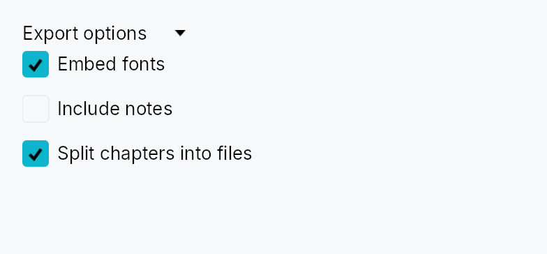
Accordion — a collapsible section with a clickable header that shows or hides its content when activated.
In the default vertical mode a horizontally-spanning header row sits above the
content; clicking or pressing Space/Enter toggles visibility with an animated
height disclosure (via Collapse).
A horizontal mode flips the header into a narrow vertical strip with a rotated
label — used by top/bottom sides of a DockingLayout. Fill mode (.fill(true))
is designed for fixed-size slots such as Splitter panes: the content fills all
available space and collapse animation is driven externally by the enclosing
pane rather than by an internal height tween.
Accessibility
The header is announced as Role::Button with aria-expanded reflecting the
current state, and aria-controls pointing at the content region
(Role::Region). Space/Enter toggle the disclosure; AT "click" actions are
also handled. The focus ring appears only on keyboard focus (not on pointer
clicks), matching the IntUI convention.
#![allow(unused)]
fn main() {
use teksilo_widgets::accordion::Accordion;
use teksilo_core::signal::Signal;
use teksilo_i18n::lit;
let expanded = Signal::new(false);
let _accordion = Accordion::new(lit!("Advanced settings"), expanded);
}
Builder methods at a glance
orientation, horizontal, fill, on_header_drag, trailing, trailing_id, title_color, title_style, content_id, content
API reference
📖 Full rustdoc API for this module
pub const ACCORDION_HEADER_HEIGHT
Height of the accordion header row in pixels (vertical mode).
#![allow(unused)]
fn main() {
pub const ACCORDION_HEADER_HEIGHT: f32 = 28.0;
}
pub const ACCORDION_HEADER_PADDING_HORIZONTAL
Horizontal padding inside the accordion header on the leading and trailing edges.
#![allow(unused)]
fn main() {
pub const ACCORDION_HEADER_PADDING_HORIZONTAL: f32 = 8.0;
}
pub const ACCORDION_INDICATOR_SIZE
Size of the chevron disclosure indicator icon in pixels.
#![allow(unused)]
fn main() {
pub const ACCORDION_INDICATOR_SIZE: f32 = 12.0;
}
pub const ACCORDION_INDICATOR_GAP
Gap between the disclosure indicator and the title label.
#![allow(unused)]
fn main() {
pub const ACCORDION_INDICATOR_GAP: f32 = 6.0;
}
pub const ACCORDION_CORNER_RADIUS
Corner radius of the keyboard-focus ring painted on the accordion header.
#![allow(unused)]
fn main() {
pub const ACCORDION_CORNER_RADIUS: f32 = 4.0;
}
pub enum AccordionOrientation
Orientation of an [Accordion]: how its header sits relative to its
content. Vertical (the default) is a
horizontal header row above the content; Horizontal
is a narrow vertical header strip (rotated-90° label, left/right
chevron) beside the content — used by top/bottom dock sides.
#![allow(unused)]
fn main() {
pub enum AccordionOrientation { /* variants */ }
}
Variants
Vertical— Header row above the content (default).Horizontal— Vertical header strip beside the content.
pub struct Accordion
A collapsible section widget whose header button shows or hides attached content.
Supply the title and a Signal<bool> for the expanded state, then attach
content via .content(w) or
.content_id(id). The signal can be toggled externally
(e.g. from a "collapse all" button) and the disclosure animation will follow.
#![allow(unused)]
fn main() {
pub struct Accordion { /* fields */ }
}
Methods
pub fn new(title: impl Into<LocalizedString>, expanded: Signal<bool>) -> Self
Create a new accordion with the given title and an external expanded signal.
The accordion starts collapsed or expanded according to the initial value of
expanded. Toggling the signal later drives the disclosure animation.
pub fn orientation(mut self, orientation: AccordionOrientation) -> Self
Set the header orientation (default AccordionOrientation::Vertical).
pub fn horizontal(mut self) -> Self
Shorthand for Accordion::orientation``(``AccordionOrientation::Horizontal``).
pub fn fill(mut self, fill: bool) -> Self
Make the expanded content fill the accordion's allotted space (the
leftover after the header) — instead of the default natural-height
disclosure — while keeping the collapse/expand animated. Use when the
accordion lives in a fixed-size slot such as a Splitter pane (a dock
panel): the content lays out at exactly the available size (no narrow
content, no overflow) and the header tween still plays. Default false.
pub fn on_header_drag(mut self, f: impl Fn(&mut EventContext) + 'static) -> Self
Make the header a drag source: a drag gesture starting on it fires
f (which should begin a drag, e.g. ctx.start_drag(source, payload)).
Tap-to-toggle is unaffected — the gesture arena tells a tap from a drag.
pub fn trailing(mut self, widget: impl Widget + 'static) -> Self
Place a widget at the trailing end of the header, before the disclosure
chevron — an options (⋮) button, an inline action toolbar, etc. The
slot's own controls capture their gestures (innermost hit wins), so
clicking them does not toggle the accordion. Mirrors
ToolBoxItem::trailing /
TabWidget::bar_trailing_slot.
pub fn trailing_id(mut self, id: WidgetId) -> Self
Like trailing but takes a pre-registered widget
id — for callers that must build the slot in-context (e.g. a slot that
itself adds boxed children). Takes precedence over trailing.
pub fn title_color(mut self, color: impl Into<ColorProp>) -> Self
Override the header foreground color used for the title text and
chevron icon. Defaults to TextRole::Primary. Accepts a literal
Color, a TextRole/SurfaceRole, or a Signal<Color>.
pub fn title_style(mut self, style: impl Into<TextStyleProp>) -> Self
Override the header title's text style. Use this to make the
disclosure label smaller (e.g. inside a tooltip) or to match a
non-body typography role. Accepts a static
TextStyle or a
TextStyleRole.
pub fn content_id(mut self, id: WidgetId) -> Self
Set the content widget by pre-registered ID.
pub fn content(mut self, widget: impl Widget + 'static) -> Self
Set an inline content widget (deferred insertion).